A symbol for ten years of books, knowledge and community
An anniversary identity concept for the New Bulgarian University Book Center, combining the human figure and the open book into one simple mark.

Problem
The New Bulgarian University Book Center needed a visual concept to mark its 10th anniversary while remaining connected to its role as a place for books, knowledge and cultural exchange.
The challenge was to create a symbol that could communicate both the human and editorial side of the center without becoming overly literal or decorative.
Solution
The concept brings together two ideas in one compact symbol: a person and an open book.
This creates a mark that can be read both as a human figure and as a reference to reading, learning and shared knowledge. A restrained green, cream and black palette, paired with clear typography, gives the anniversary identity a contemporary but institutional character.
More Than a Book
The central idea was to avoid representing the Book Center through a conventional book symbol alone.
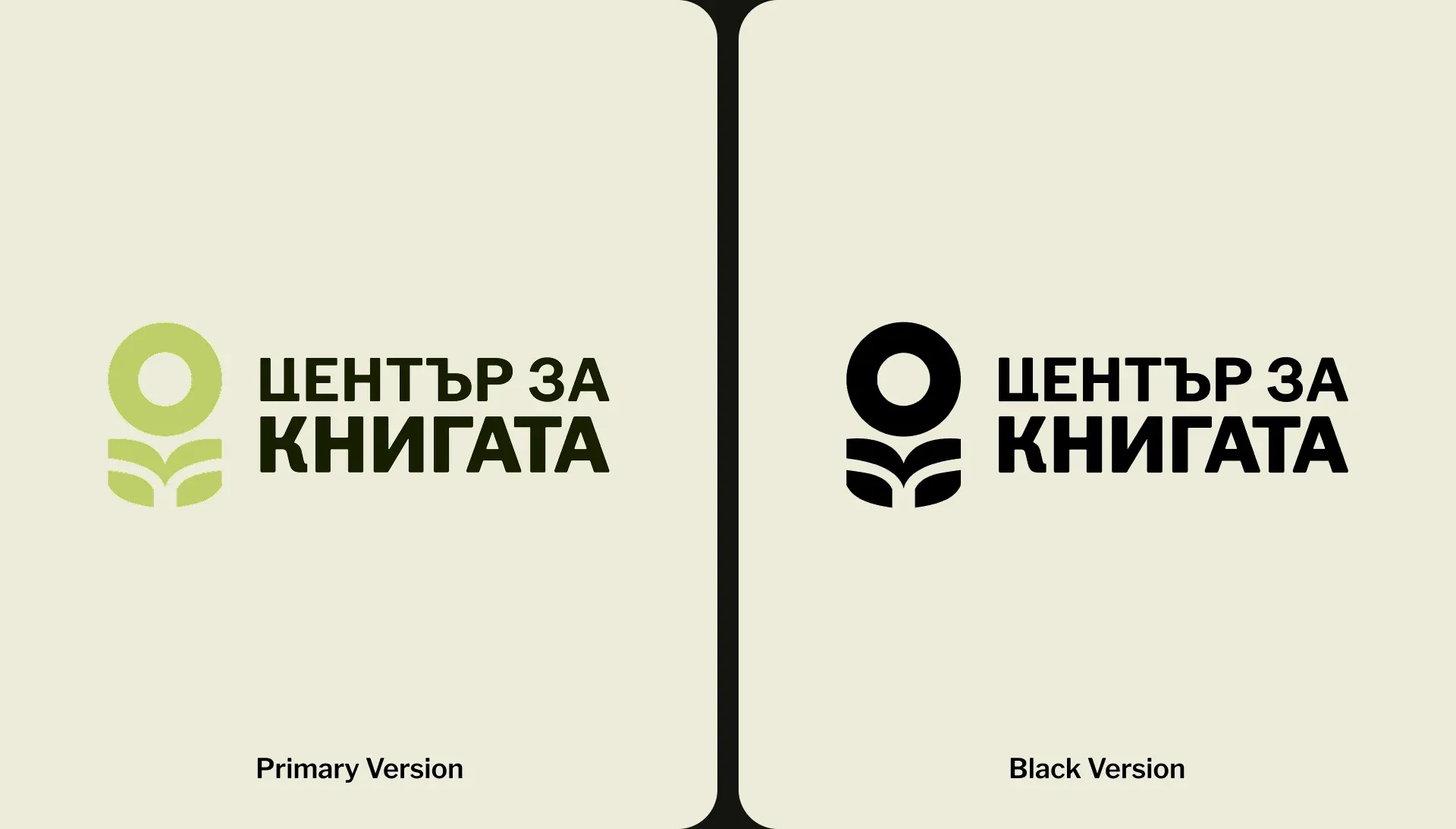
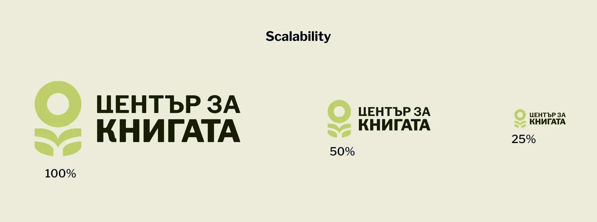
The final mark combines an open book with a simplified human figure, turning reading into something more active and communal. The symbol is designed to work both independently and together with the Book Center name across different formats.

A Quiet System Around the Mark
The supporting system stays intentionally restrained so the symbol remains the strongest element of the identity.
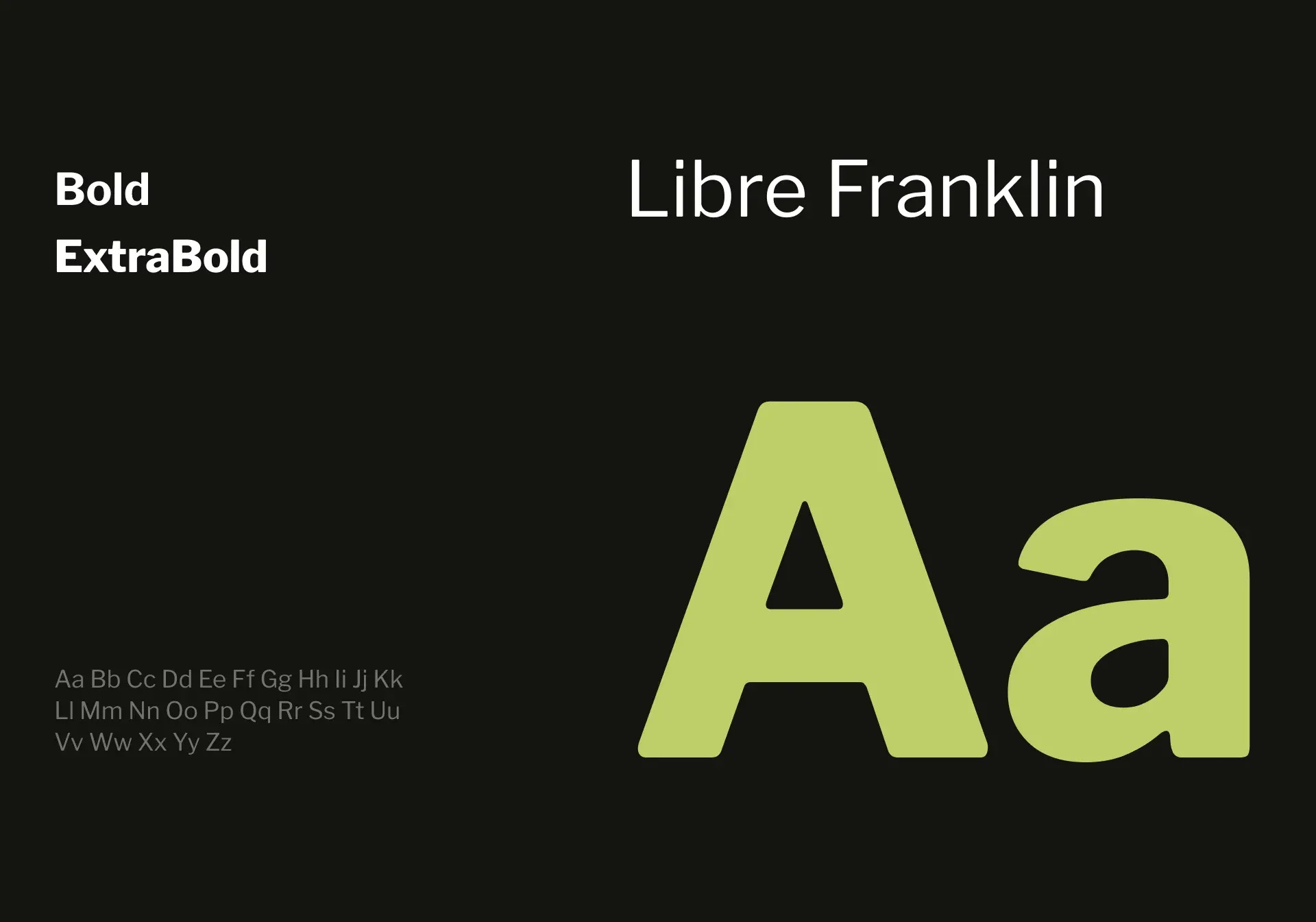
Soft green, warm neutral tones and deep dark green create a calm palette associated with books and culture, while Libre Franklin provides a clean typographic structure that keeps the system contemporary and highly readable.

Carrying the Identity Further
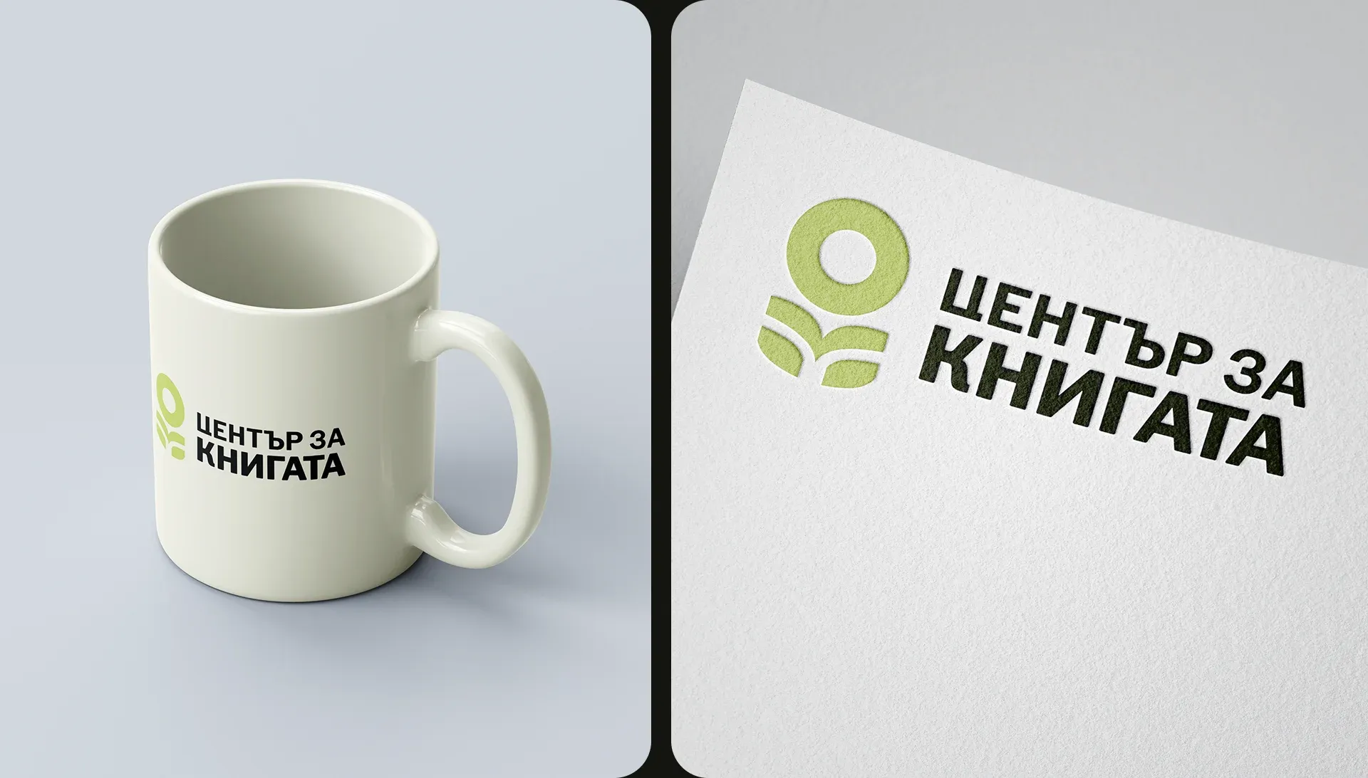
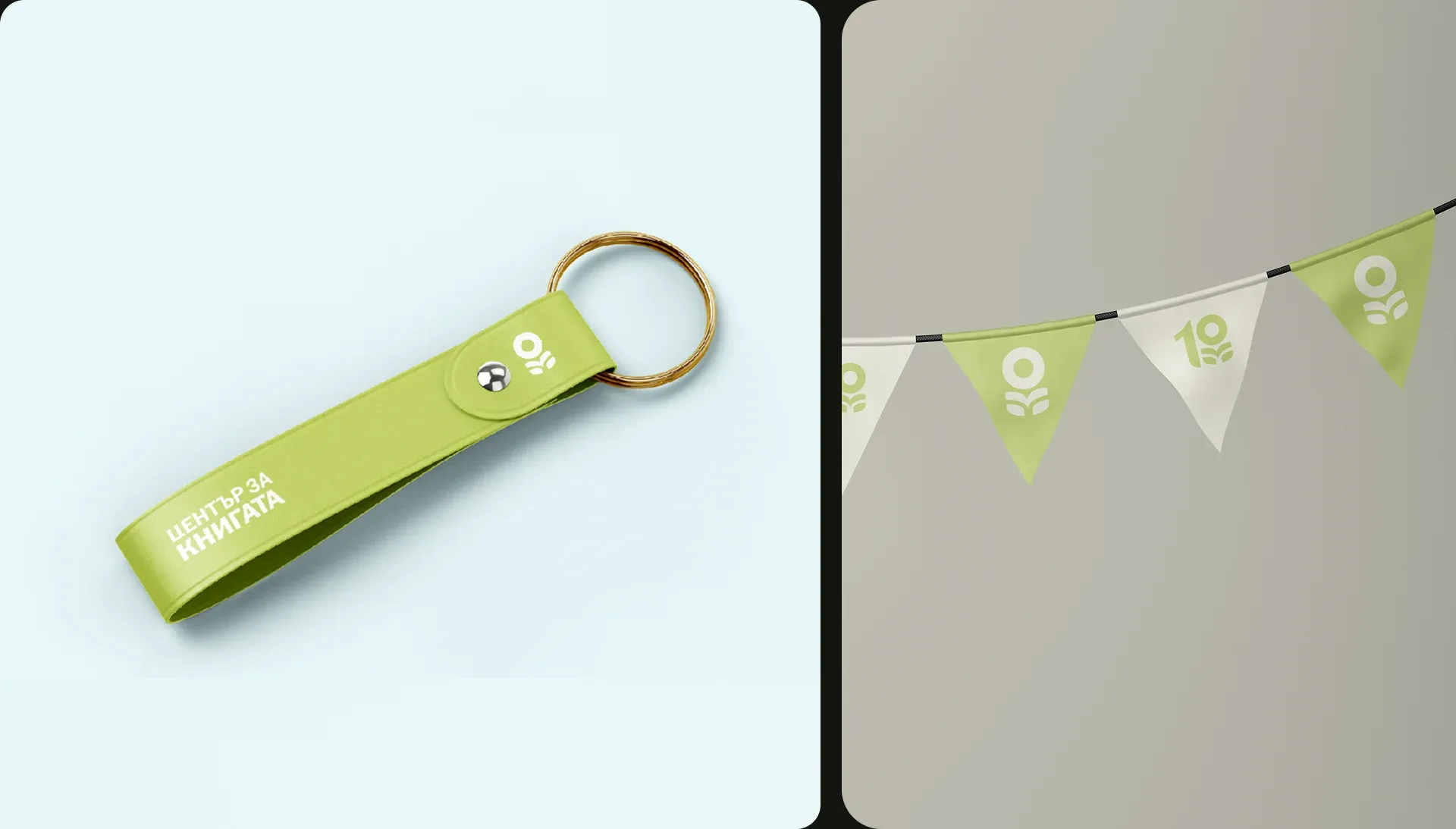
The system also extends into objects that could appear around events, celebrations and the everyday life of the Book Center.
Using the symbol as a standalone graphic element keeps these applications simple while making the anniversary identity easy to recognize from a distance.

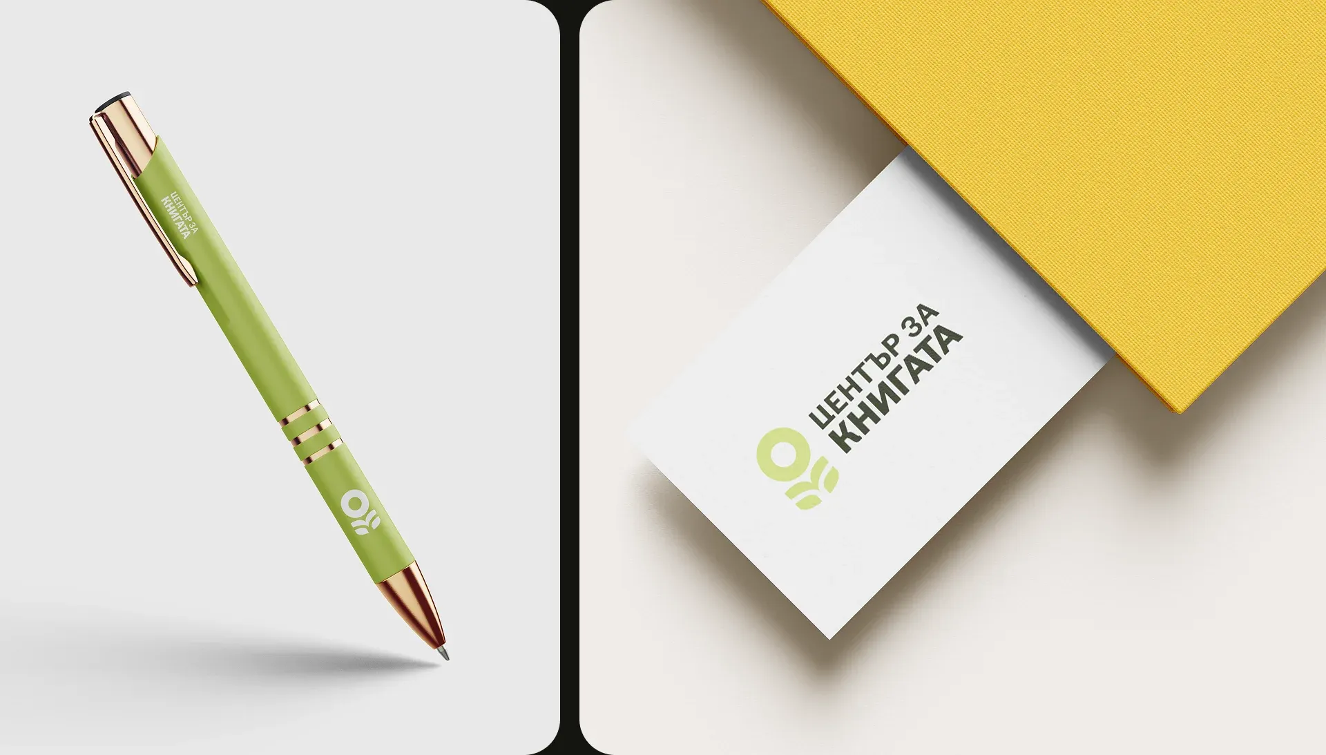
Small Touchpoints, Same Identity
Smaller applications test whether the identity can remain consistent when reduced to everyday details.
From stationery to simple branded objects, the limited palette and compact mark allow the system to remain clear without requiring additional graphic elements.