Making urban parking simpler through a clear and intuitive mobile experience
A branding and UX/UI concept for a parking app designed to help drivers find, reserve and manage parking spaces with less friction.
Problem
Finding parking in busy urban areas can be frustrating, time-consuming and unpredictable.
Drivers often have to switch between different sources of information, search manually for available spaces and deal with unclear pricing or limited visibility of parking options.
The challenge was to create a digital experience that makes the process feel faster, clearer and easier from the moment a user starts searching to the moment the parking session ends.
Solution
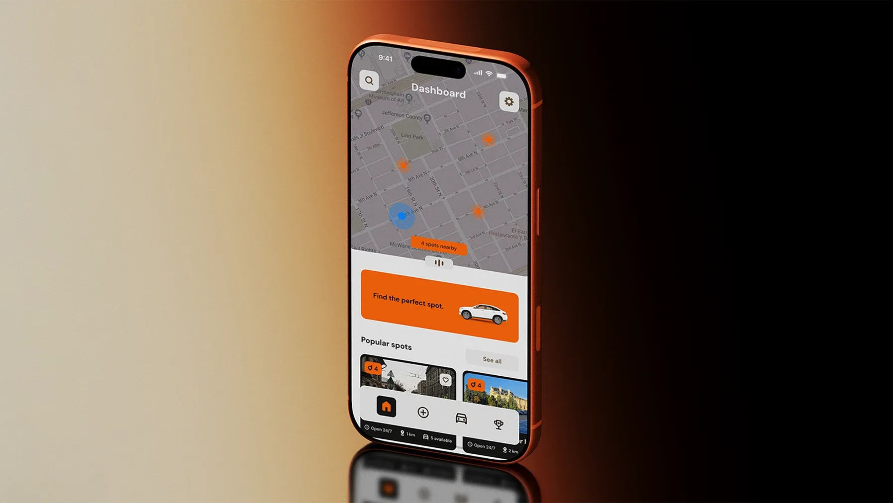
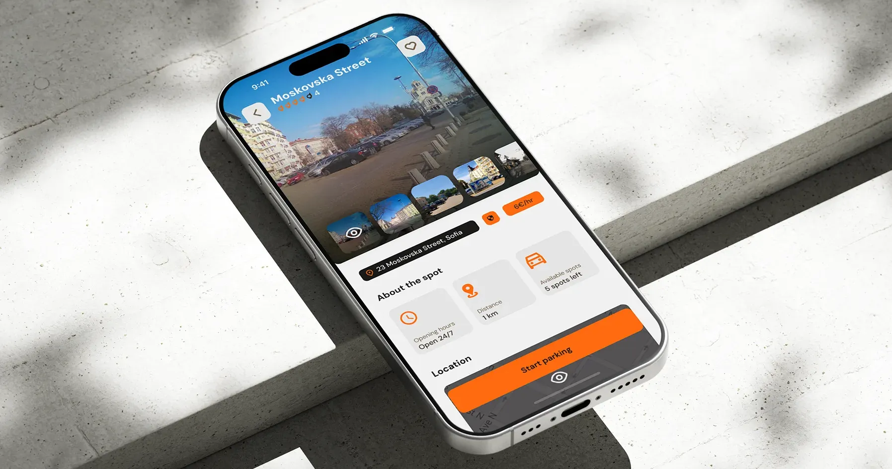
Vexo was designed as a mobile parking experience that brings the essential steps into one clear flow.
The app focuses on helping users quickly discover nearby parking options, understand availability and pricing, reserve a space and manage their parking session from one place.
The visual identity and interface were developed together to create a product that feels modern, recognizable and easy to use.
Parking, Without the Friction
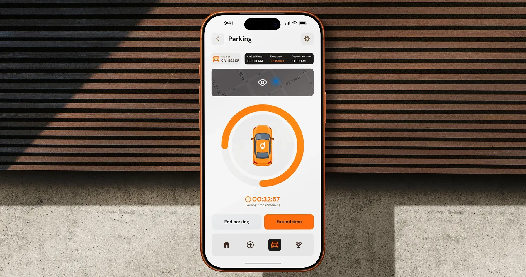
Vexo is built around the moments that matter most while parking: finding a spot, checking the details and keeping track of an active session.
The interface keeps essential information easy to scan and reduces the number of steps between searching for parking and getting back on the road.
A Brand That Works Beyond the App
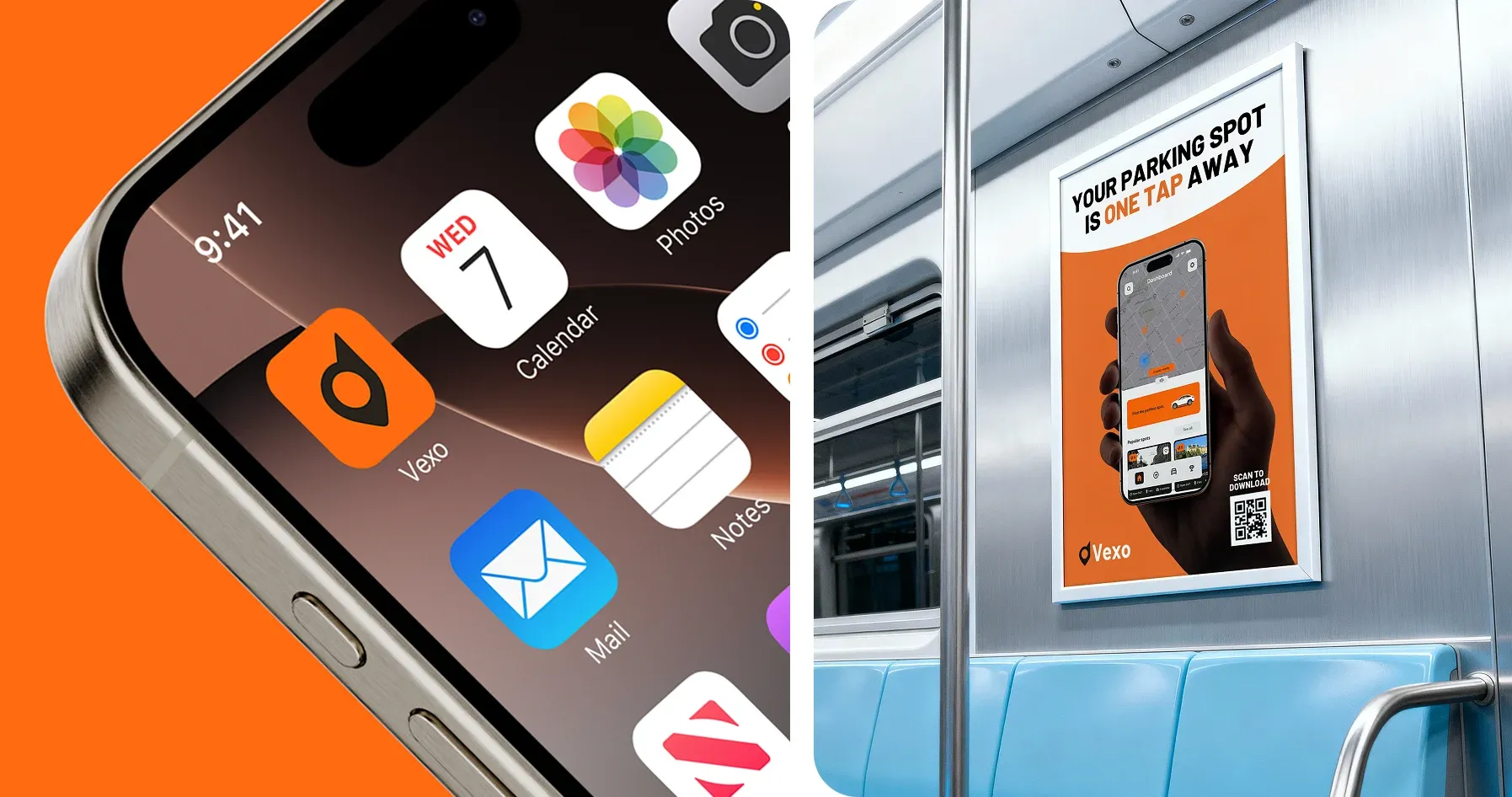
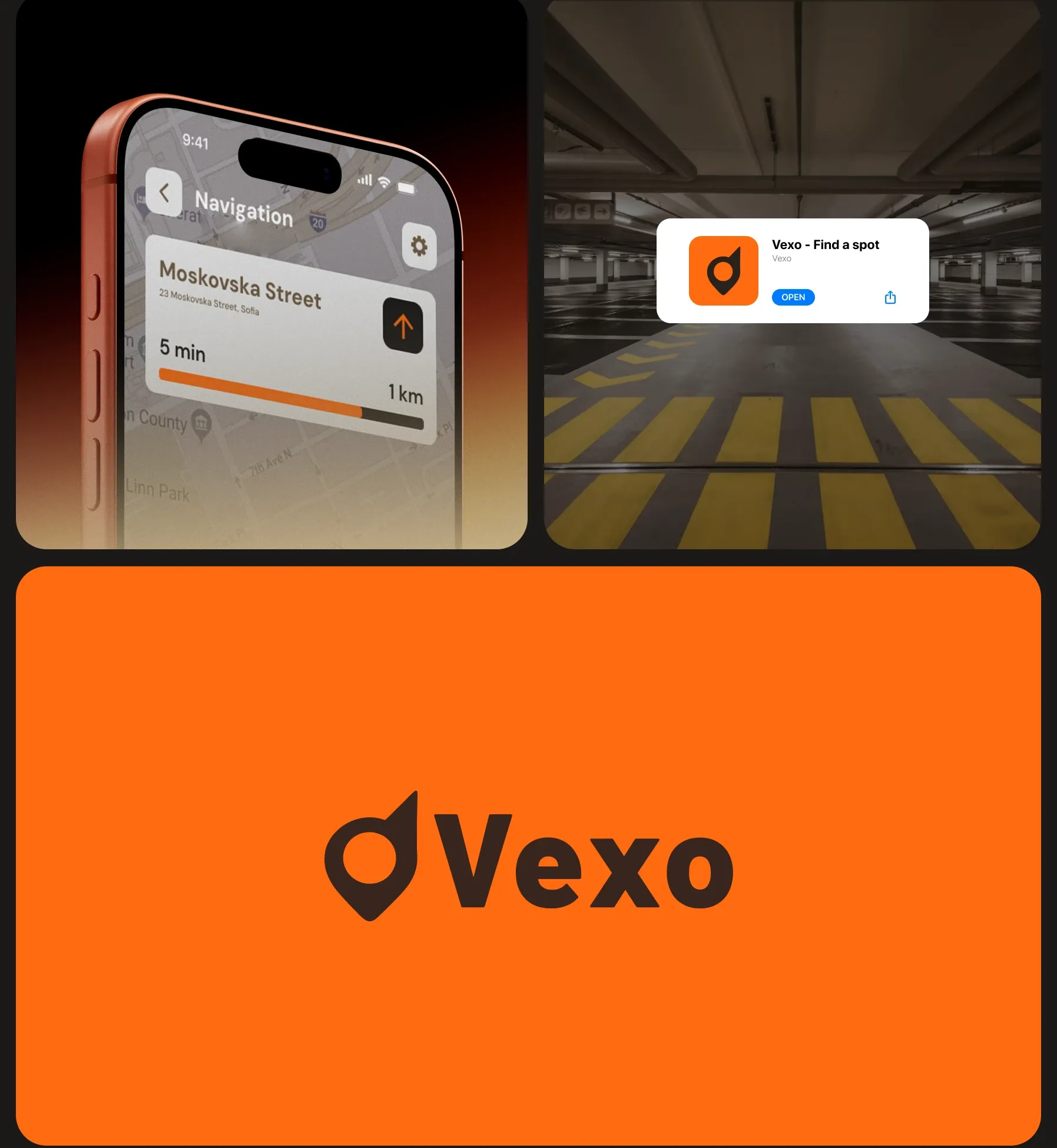
The identity was designed to stay recognizable across different digital touchpoints, not just inside the product.
The orange accent, simple symbol and focused visual language create a consistent connection between the app, notifications and brand communication.
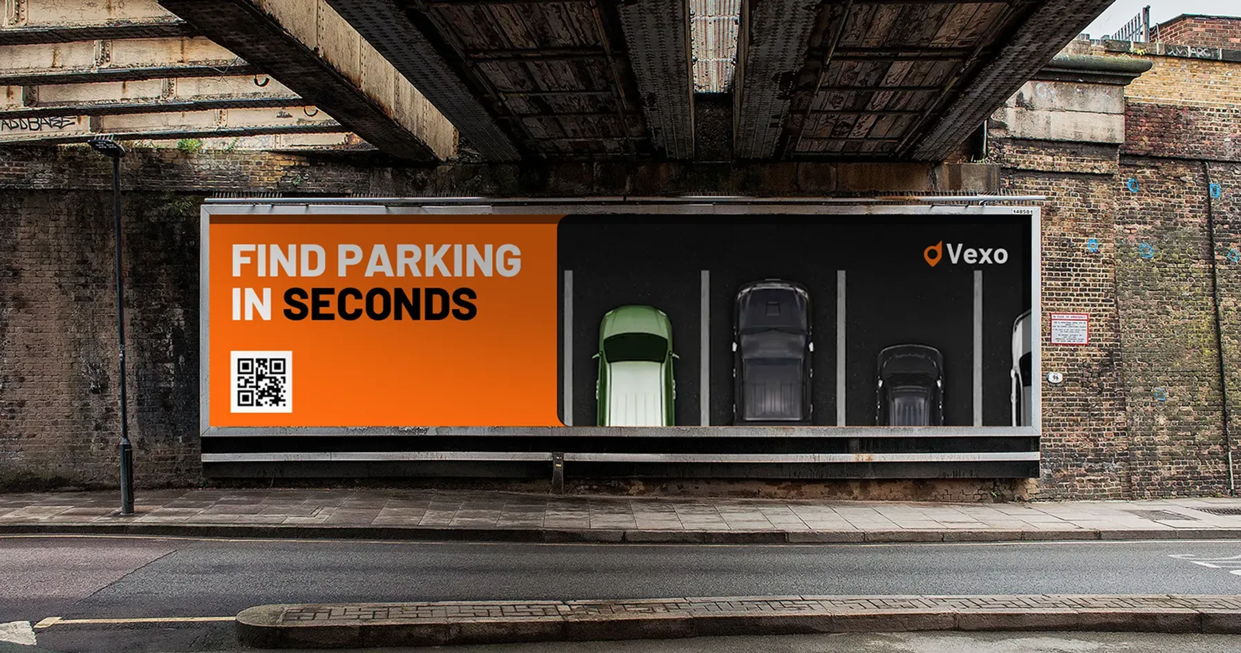
Find Parking in Seconds
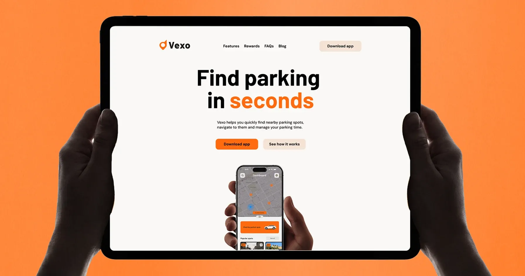
The product experience was also explored beyond mobile to show how the same system could translate into a broader digital presence.
Clear messaging and a restrained interface keep the value of the product immediately understandable.
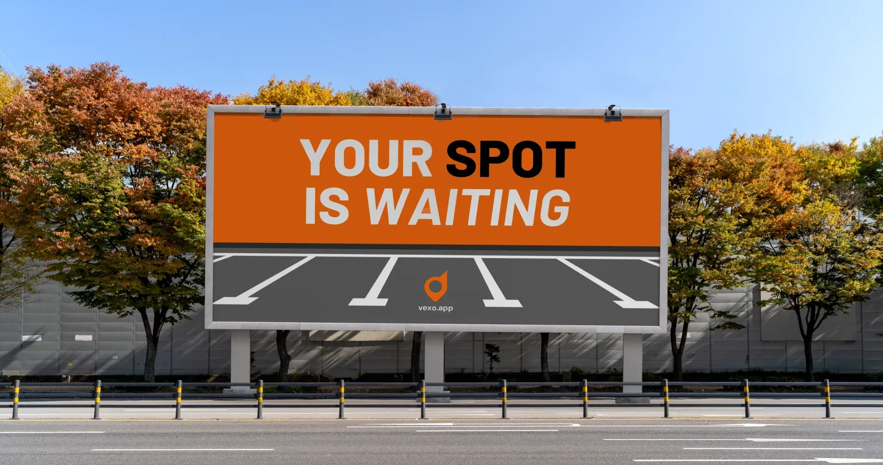
Your Spot Is Waiting
The campaign brings Vexo into the same environments where the parking problem actually happens.
Short messages, strong contrast and the orange brand color make the communication easy to recognize from a distance while keeping it closely connected to the product.