Reframing ARTISUN through light, craft and natural form
A visual identity inspired by the brand’s connection to craftsmanship, natural materials and the Mediterranean sun.
Problem
ARTISUN already carries a strong connection to craftsmanship, natural materials and the Mediterranean lifestyle, but the challenge was to translate those qualities into a clearer and more contemporary visual system.
The identity needed to feel refined without becoming overly luxurious or decorative, while remaining flexible enough to work across digital experiences, campaigns, packaging and everyday brand applications.
Solution
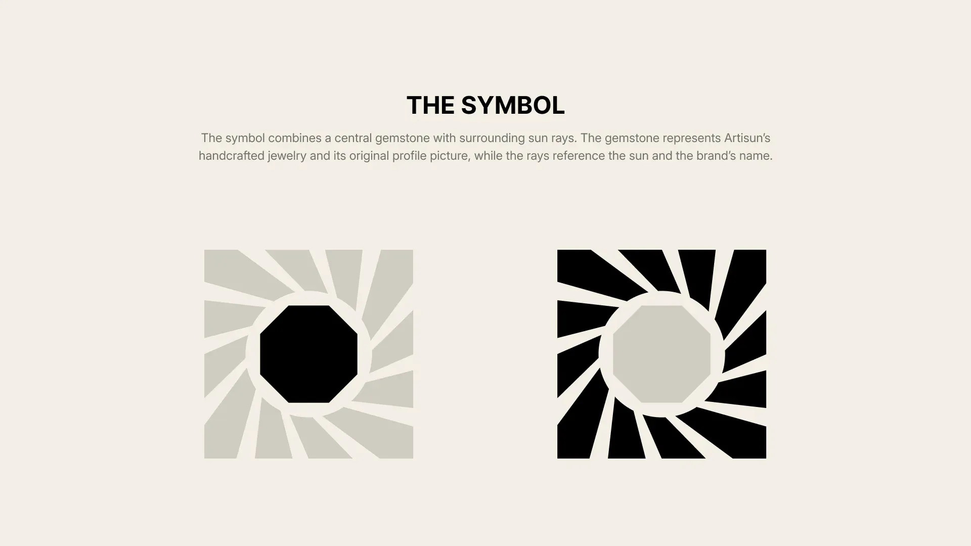
The concept centers on a geometric sun symbol built from repeated forms around a simple core.
An earthy palette of green, warm neutrals, muted orange and deep black supports the connection to natural materials, while clean layouts and strong imagery give the identity a more contemporary character.
The result is a system that can move naturally between digital and physical applications without losing its recognizability.
Shaping the Sun
The identity begins with the sun as its central visual idea.
The mark is constructed from repeated geometric forms arranged around a simple center, creating a symbol that feels organic while remaining controlled and recognizable.
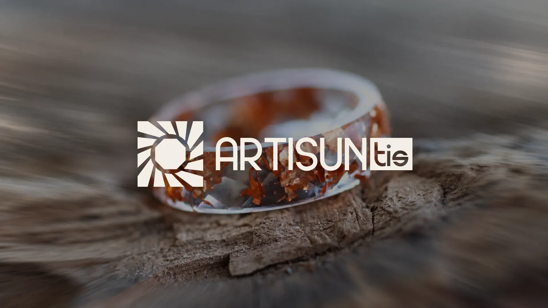
The system allows the symbol to work independently or together with the ARTISUN wordmark depending on the application.
Drawn from the Earth
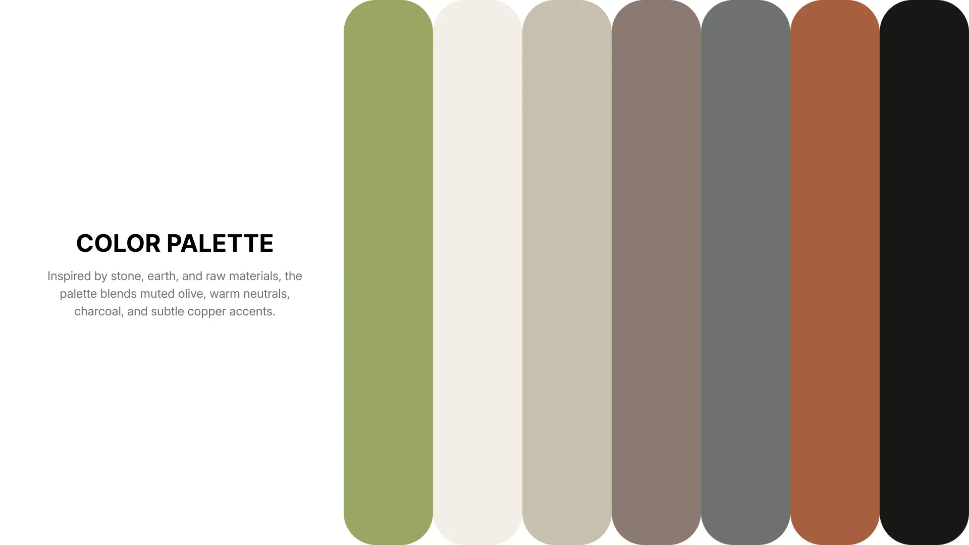
The color palette draws from natural and tactile materials rather than relying on traditional luxury colors.
Soft green, cream, stone grey, warm taupe, muted orange and deep black create a grounded system that can shift between calm editorial layouts and more expressive campaign work.
Bringing the Identity Online
The digital direction translates the identity into a more immersive brand experience where product imagery and the visual system can work together.
Large photography, restrained typography and generous spacing keep the focus on the products while the sun symbol and earthy palette maintain a clear connection to the wider identity.
The website walkthrough shows how the system behaves in motion across the full browsing experience.
Made to Be Seen
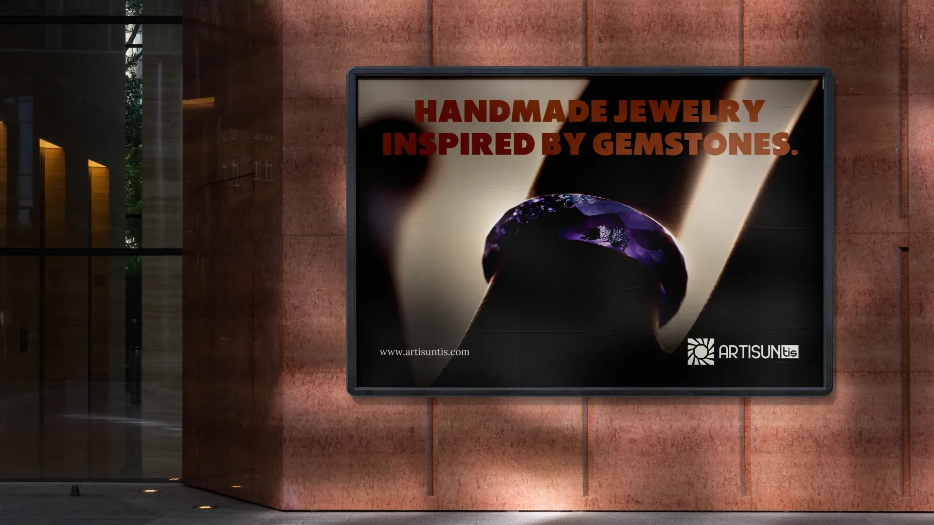
The campaign direction pushes the identity into a bolder visual space.
Strong photography, high contrast and direct messaging allow ARTISUN to stand out in larger advertising formats while still retaining the restrained character of the core brand system.
From Identity to Object
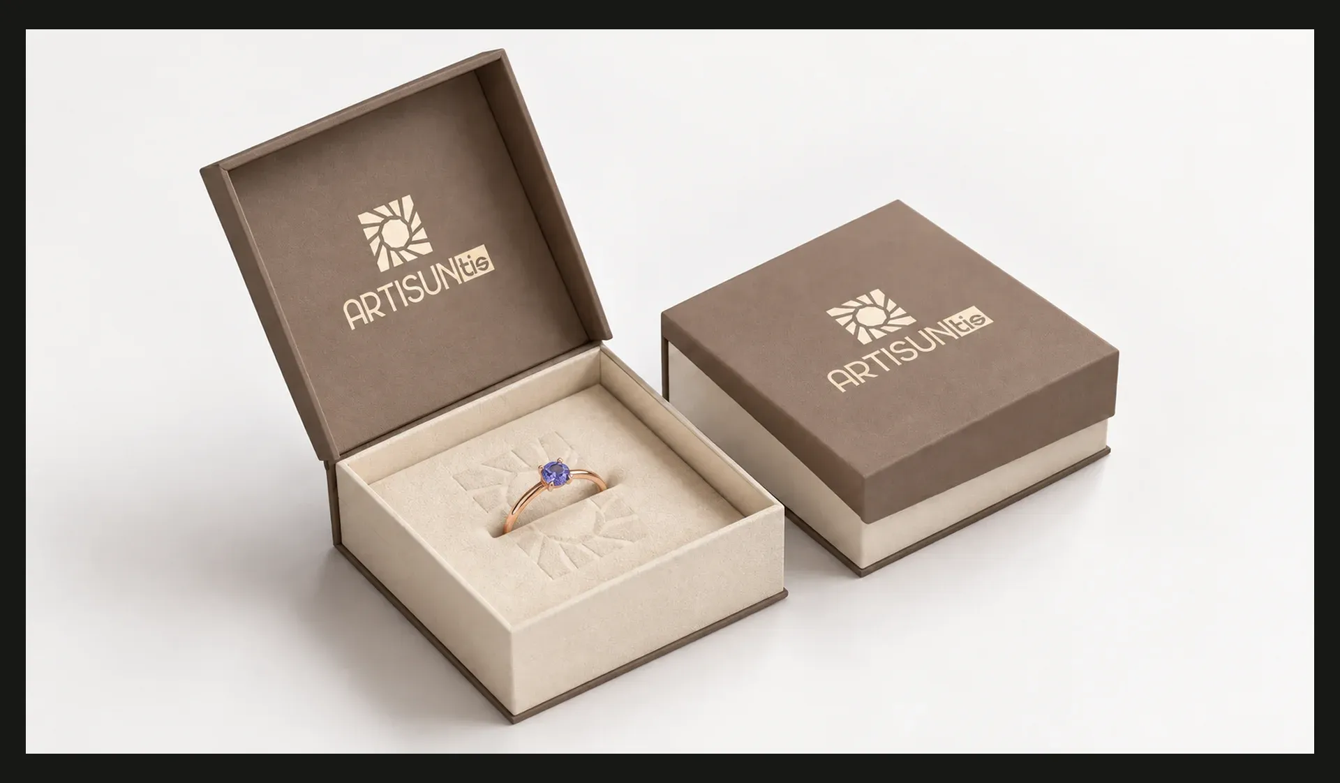
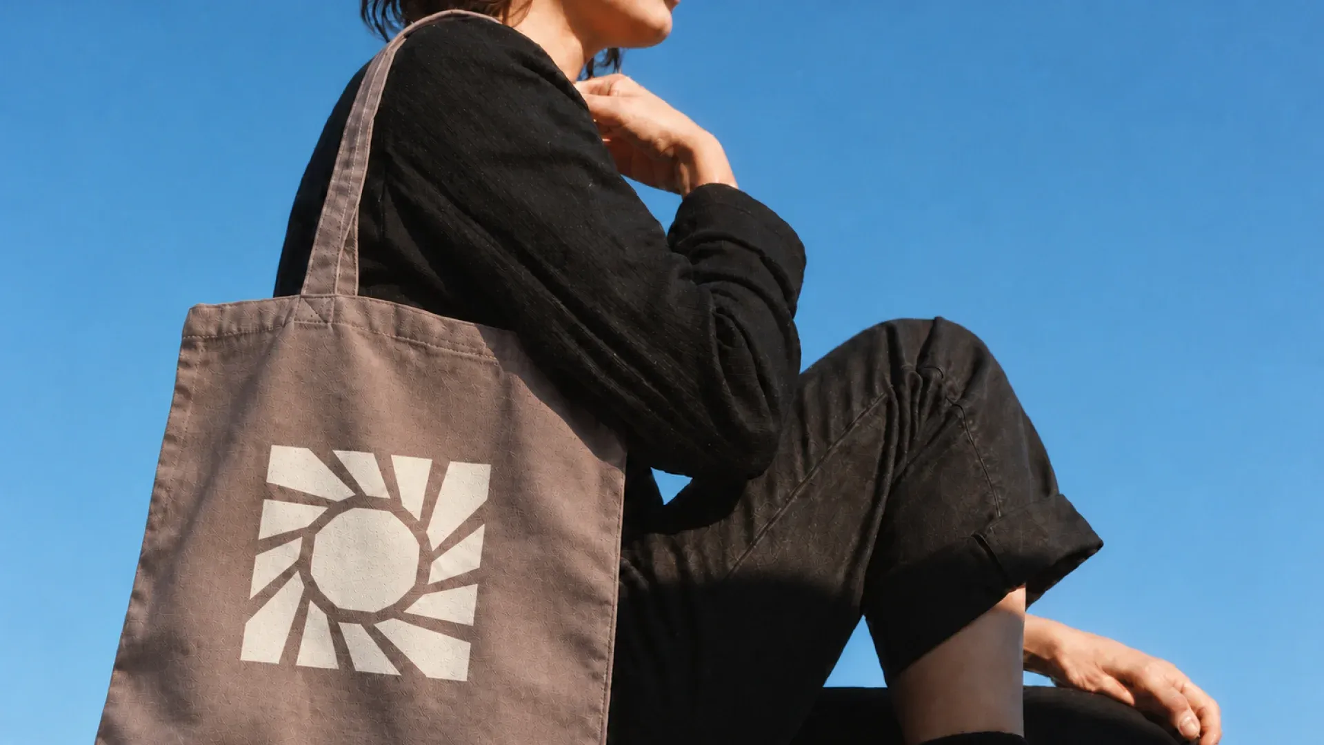
The identity was also explored across physical applications to test how the symbol behaves beyond the screen.
The bold sun mark works as a recognizable standalone graphic on merchandise, while the softer neutral palette gives the packaging a more tactile and considered feel.
Together, these applications show how the visual system can remain consistent across very different materials and scales.