Designing a home for Bulgaria’s hardest Geometry Dash levels
A responsive platform for exploring ranked levels, verified completions and the players behind Bulgaria’s Geometry Dash community.
Problem
BGDL brings together rankings, level information, player records and verified completions in one platform. With so much competitive data on screen, the experience could easily become dense and difficult to navigate.
The challenge was to create an interface that feels connected to Geometry Dash and its competitive community while keeping rankings, levels and important actions easy to understand at a glance.
Solution
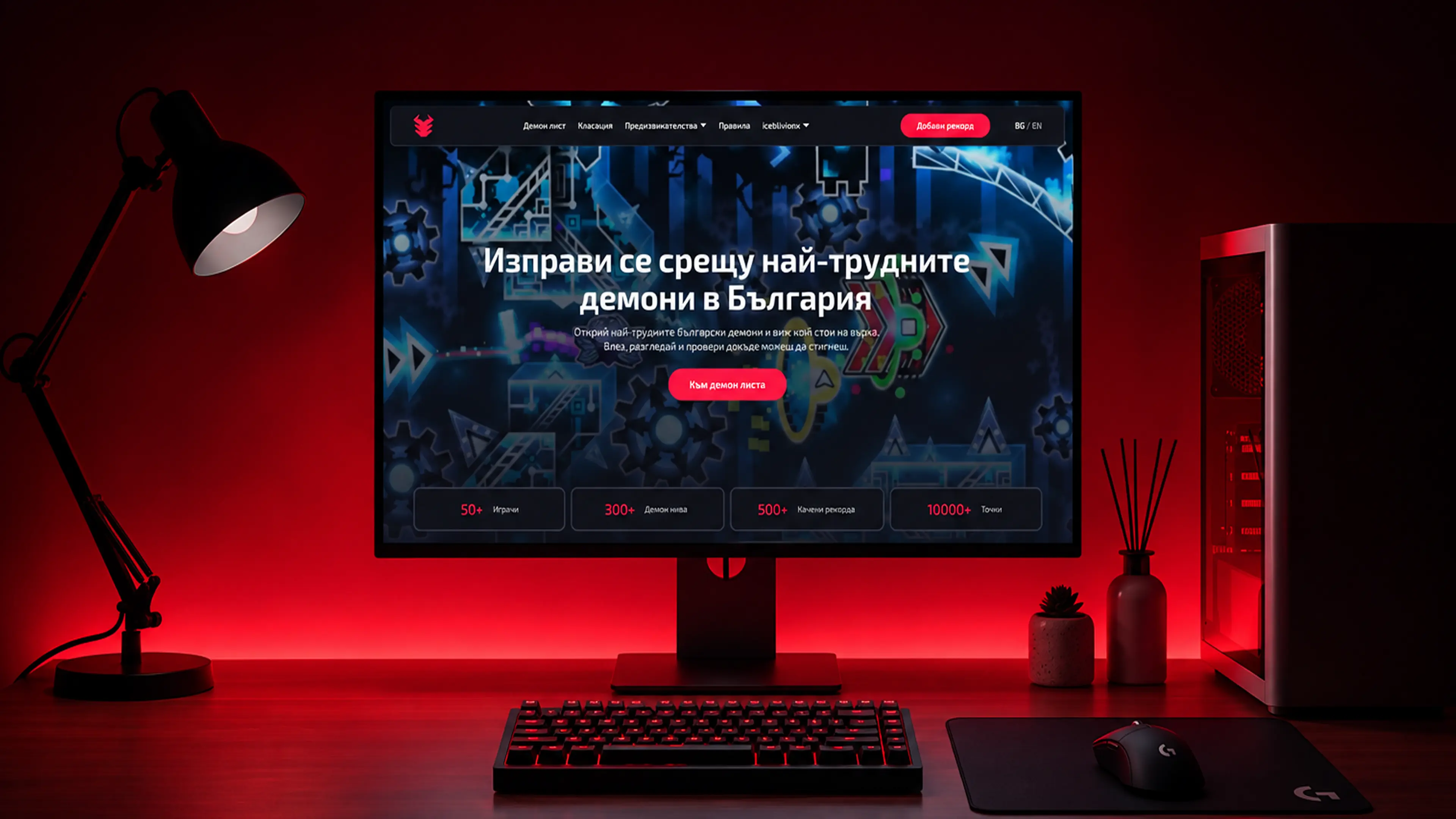
The interface uses a dark foundation, strong red accents and clear visual hierarchy to create a focused competitive atmosphere without sacrificing usability.
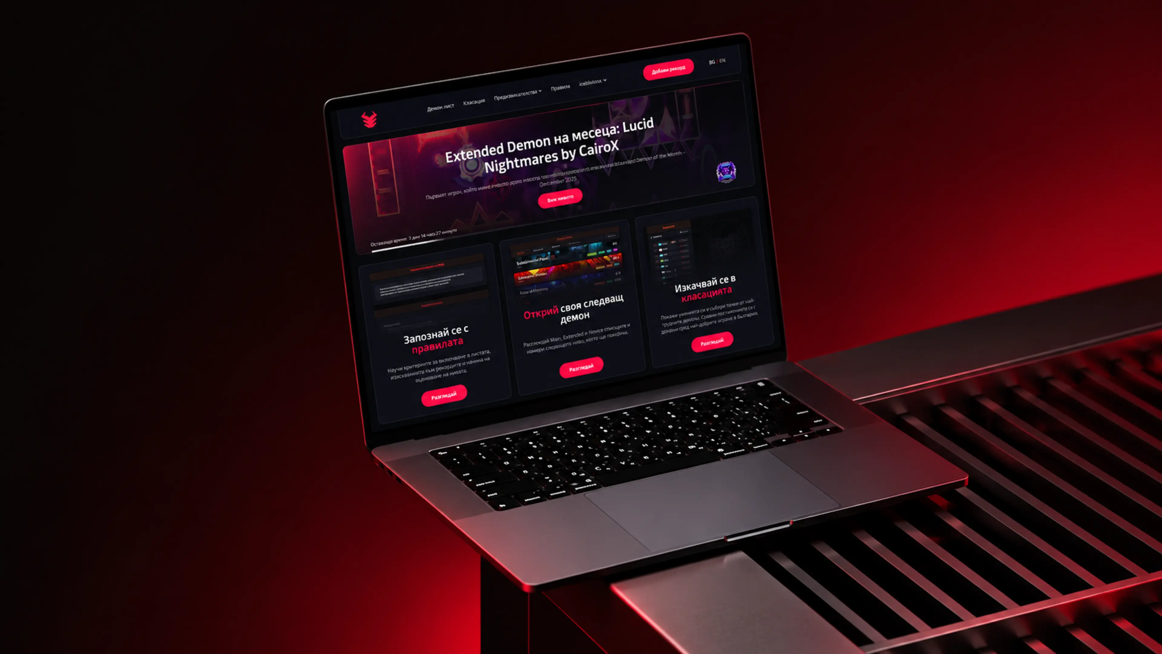
Cards, status colors and structured layouts separate different types of information, while the responsive system keeps the same experience consistent across desktop, laptop and mobile screens.
Built for the Grind
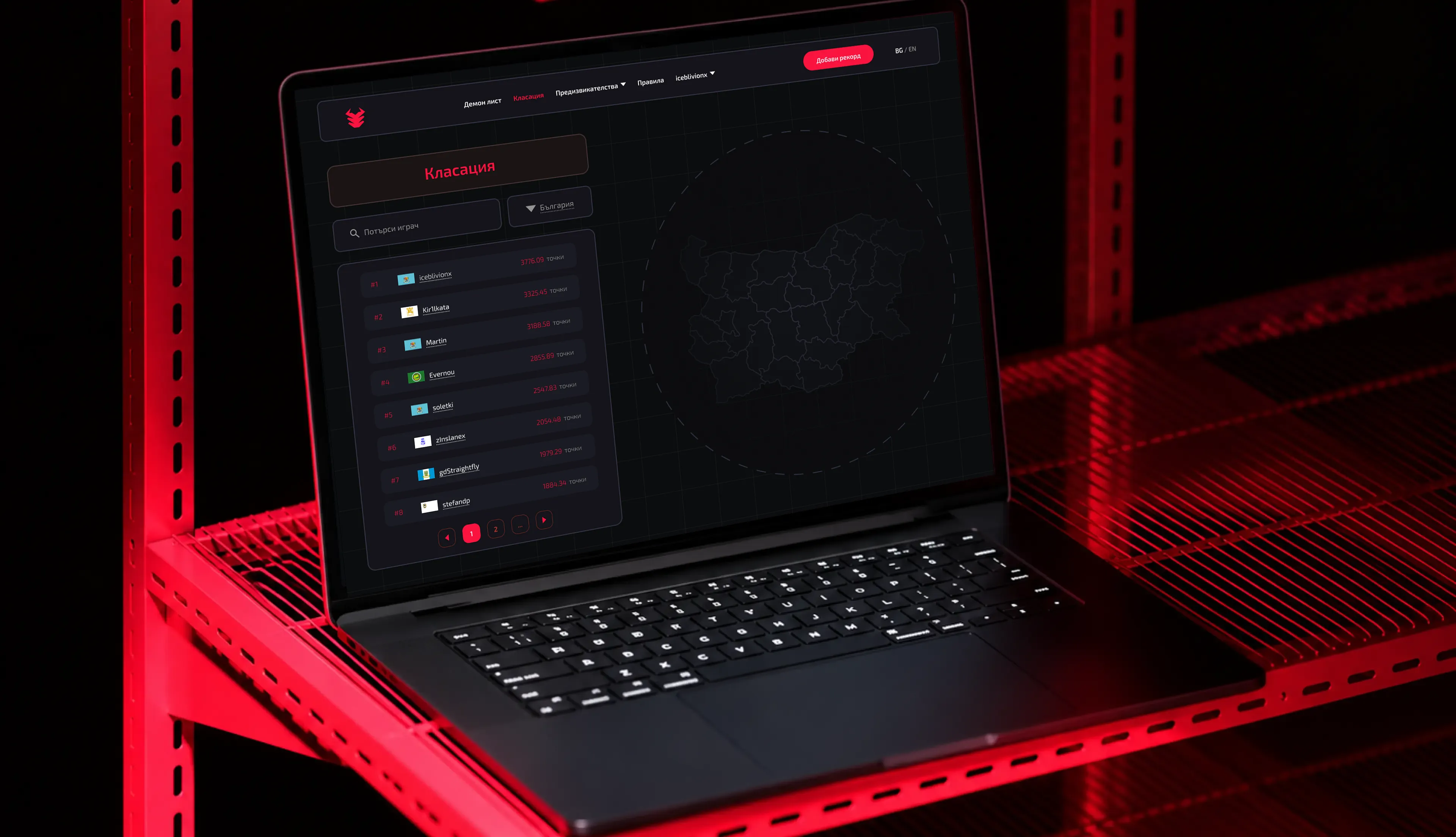
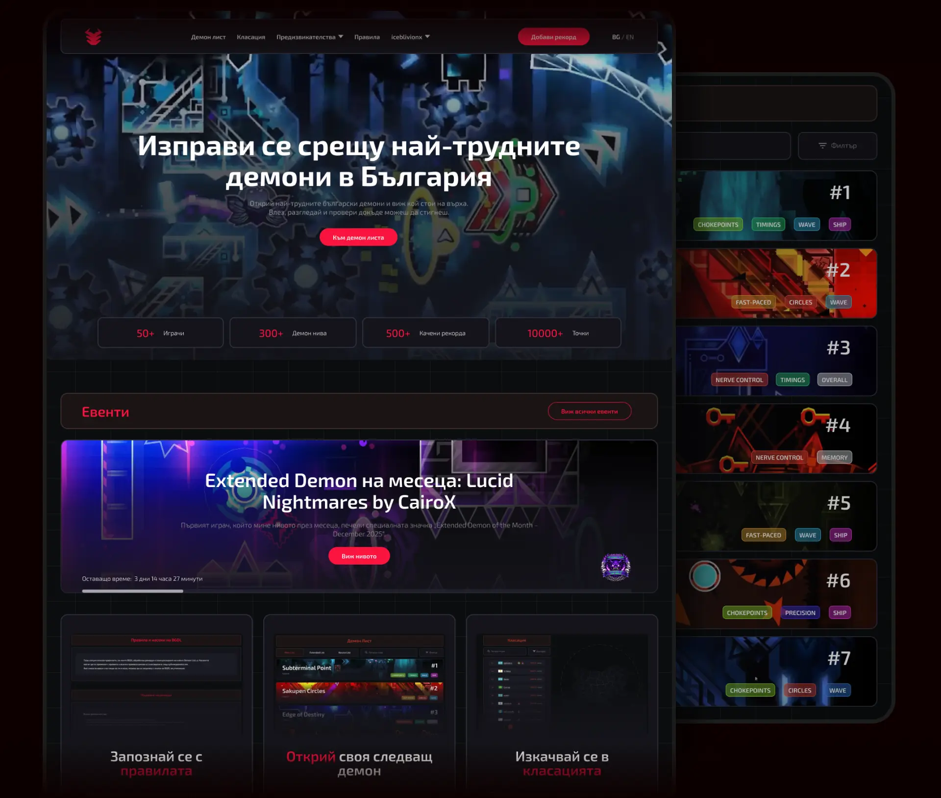
The interface was designed around the competitive nature of Geometry Dash, using a dark environment and sharp red accents to create a focused, high-energy experience.
Large featured content and clear navigation establish the hierarchy immediately, while the darker surrounding UI keeps attention on levels, rankings and player activity.
The Hardest Levels, Made Clear
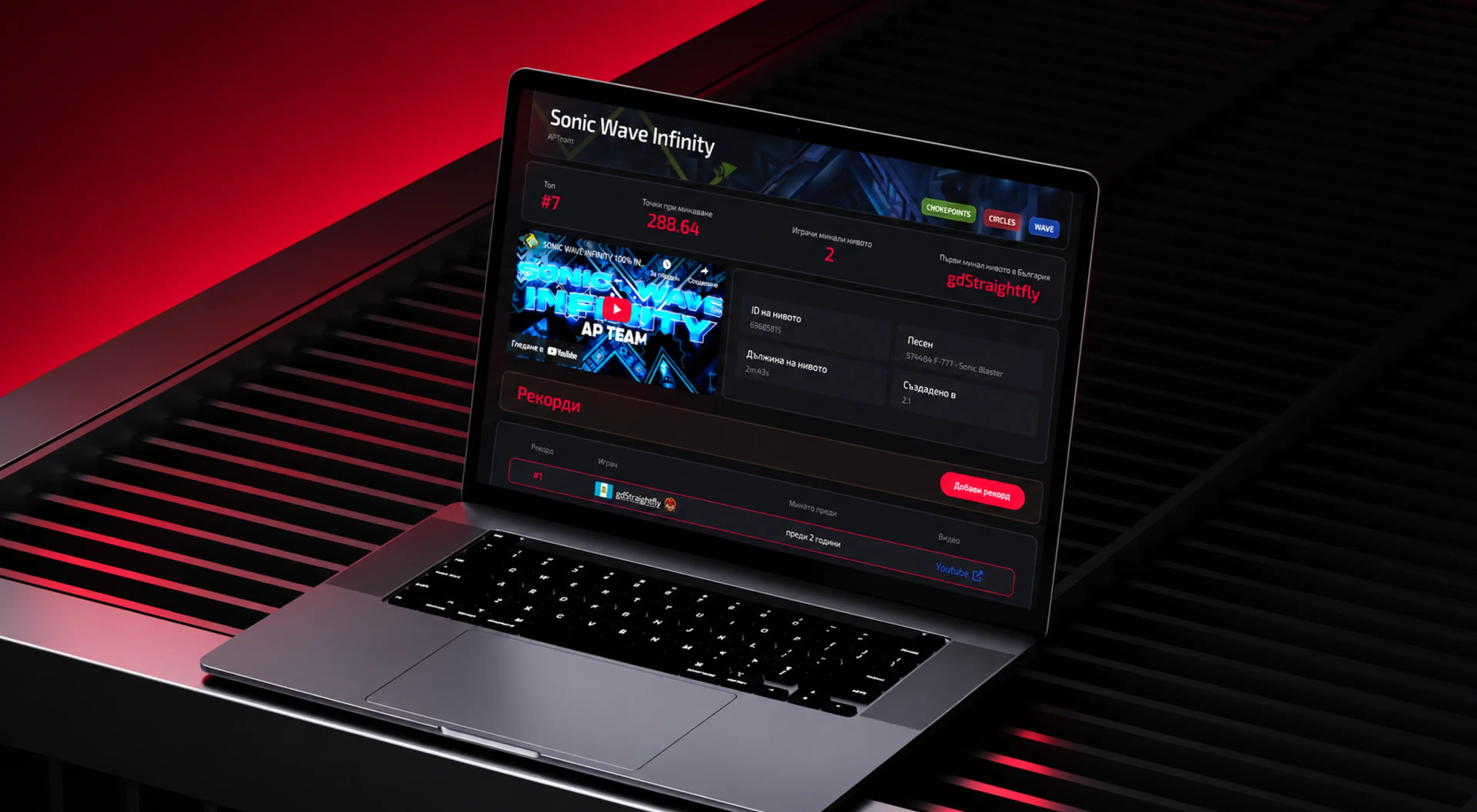
The core experience is built around discovering and comparing ranked levels.
Content is separated into clear cards and sections so users can quickly scan difficulty, records and other relevant information without losing their place in a data-heavy interface.
The visual hierarchy keeps the list feeling structured while still giving each level enough personality.
Rankings in Your Pocket
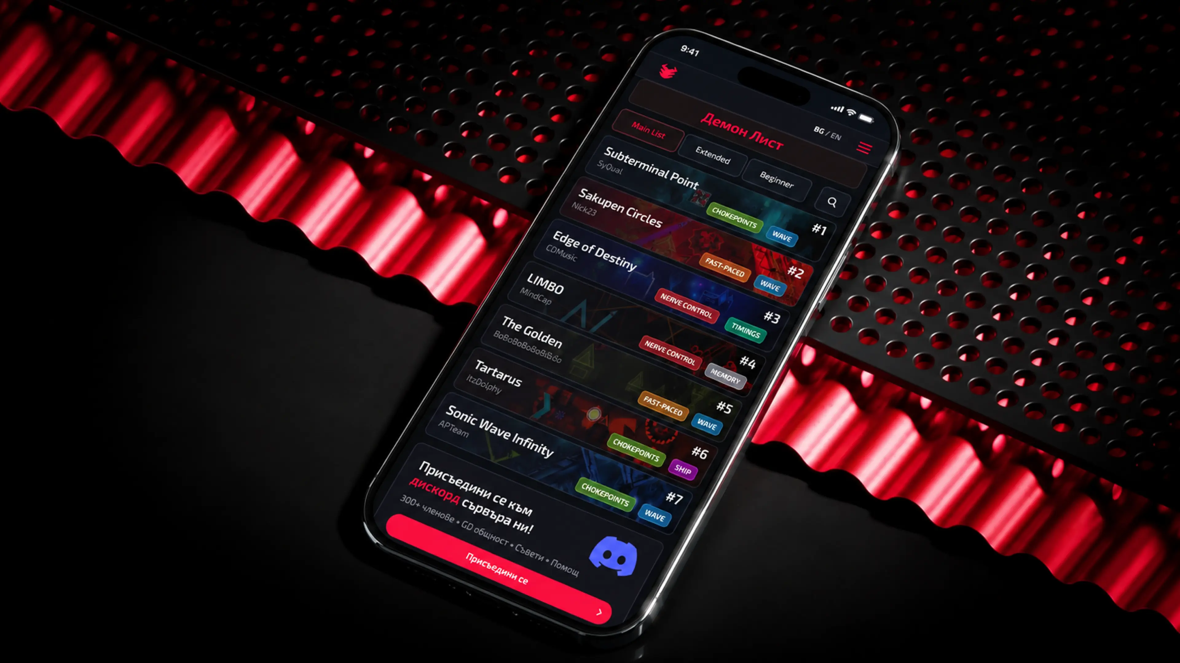
The responsive experience keeps the same hierarchy on smaller screens without simply shrinking the desktop layout.
Level information is reorganized into a more focused vertical flow, making rankings and records easy to browse from a phone while preserving the visual character of the platform.
A System for Competitive Data
A consistent visual system helps distinguish different states and types of information across the platform.
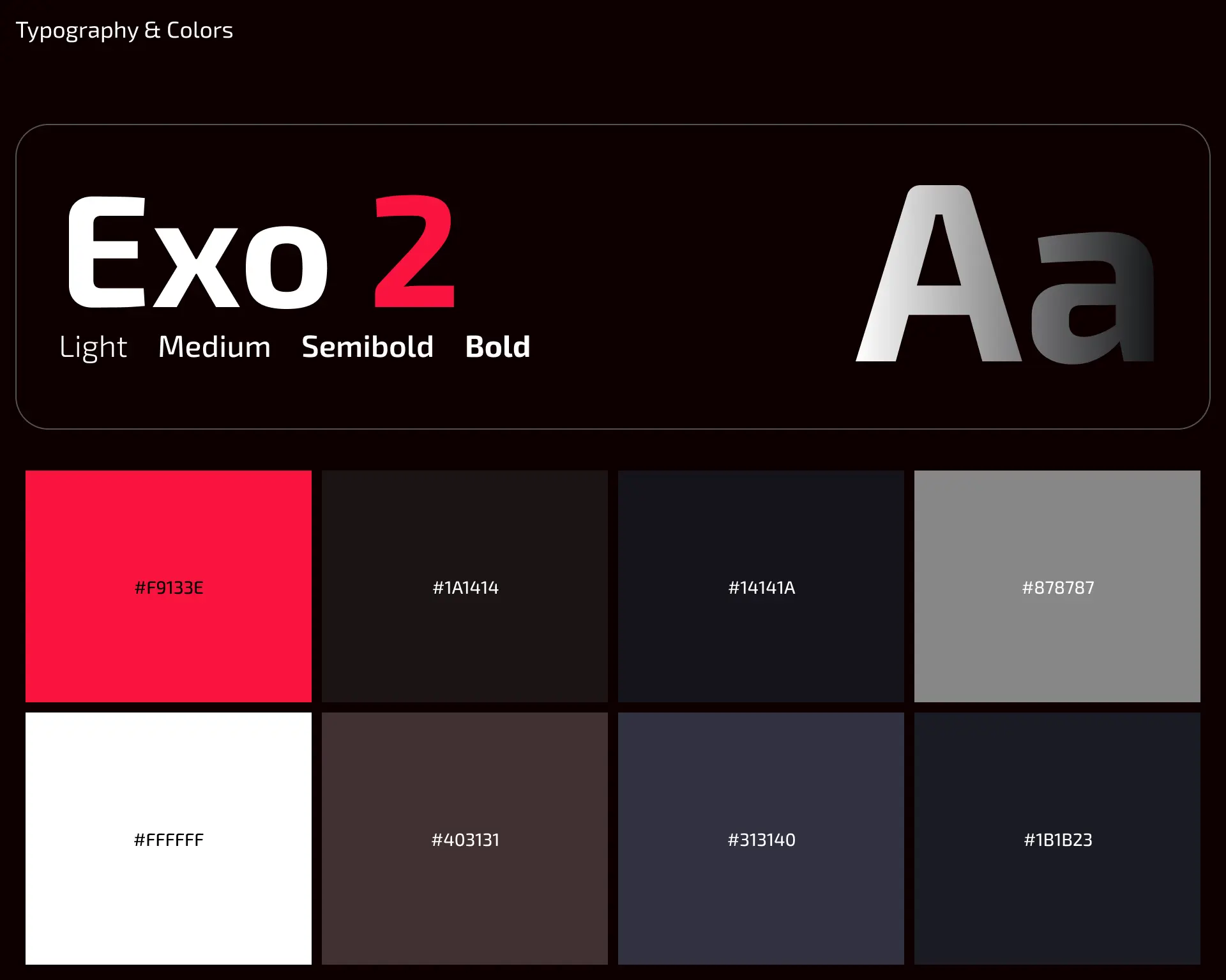
Exo 2 reinforces the digital and gaming character, while red, dark neutrals and supporting status colors create contrast between primary actions, level information and competitive data.
The system was designed to stay readable even when multiple rankings, labels and statistics appear together.