Making social impact feel more human
HumAct is an ESG-focused platform that connects people with volunteer opportunities based on their interests and values. It encourages community engagement and supports mental well-being. Created during Digital Marathon 2026 at New Bulgarian University, the project won first place.

Problem
Volunteering and social impact platforms can often feel formal, distant or overly institutional.
HumAct needed an identity that could communicate purpose and credibility while still feeling personal, optimistic and accessible to people who may be discovering volunteering for the first time.
Solution
The identity combines a simple symbol, warm colors and an approachable visual system to make participation feel less intimidating and more human.
The system was designed to work across digital touchpoints, campaigns and physical applications while keeping the idea of connection and positive action at the center.
A Symbol for Taking Part
The identity starts with a simple hand-inspired symbol representing action, support and the idea of people reaching toward one another.
Paired with a clean wordmark and a bright visual language, the mark is designed to stay recognizable whether it appears as the main identity or as a small standalone brand element.

Built to Feel Positive
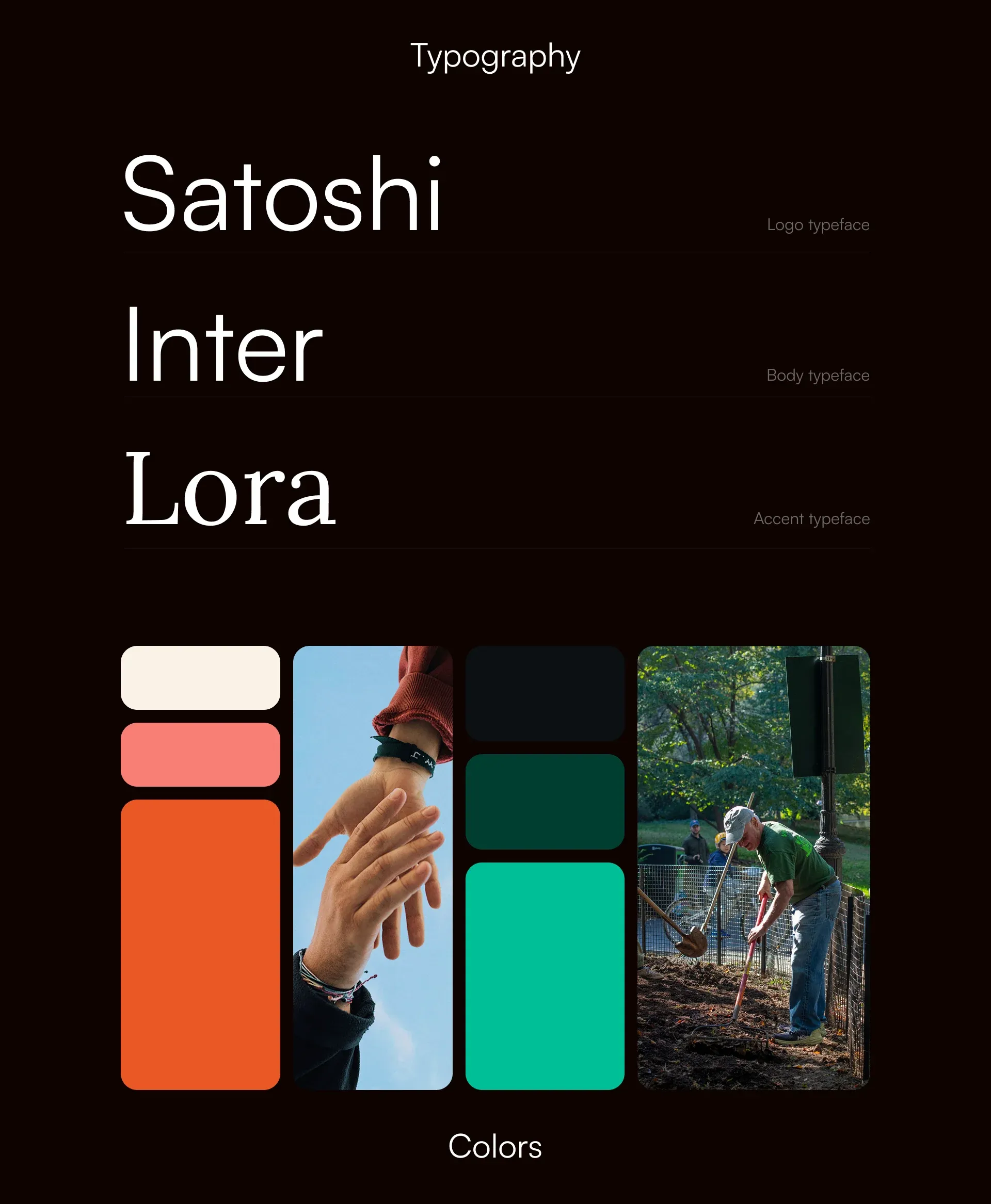
The visual system balances energy with clarity. Orange brings warmth and action, while green and blue expand the palette into a more flexible system for different types of communication.
Typography and photography keep the identity contemporary while allowing the human side of the brand to remain visible throughout the system.
Small Actions, Visible Impact
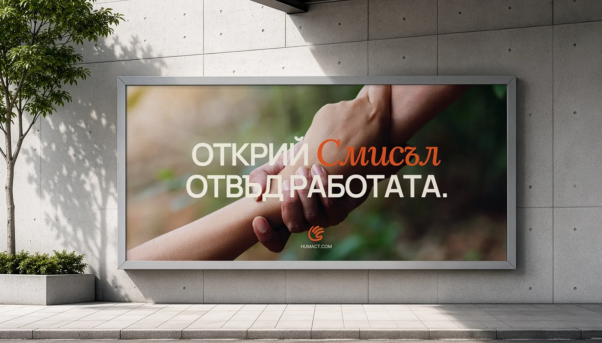
Campaign communication focuses on the people behind the impact rather than abstract sustainability language.
Human imagery, short messaging and strong brand colors make the idea easier to understand at a glance and give HumAct a more direct and encouraging voice.
Made to Live Beyond the Logo
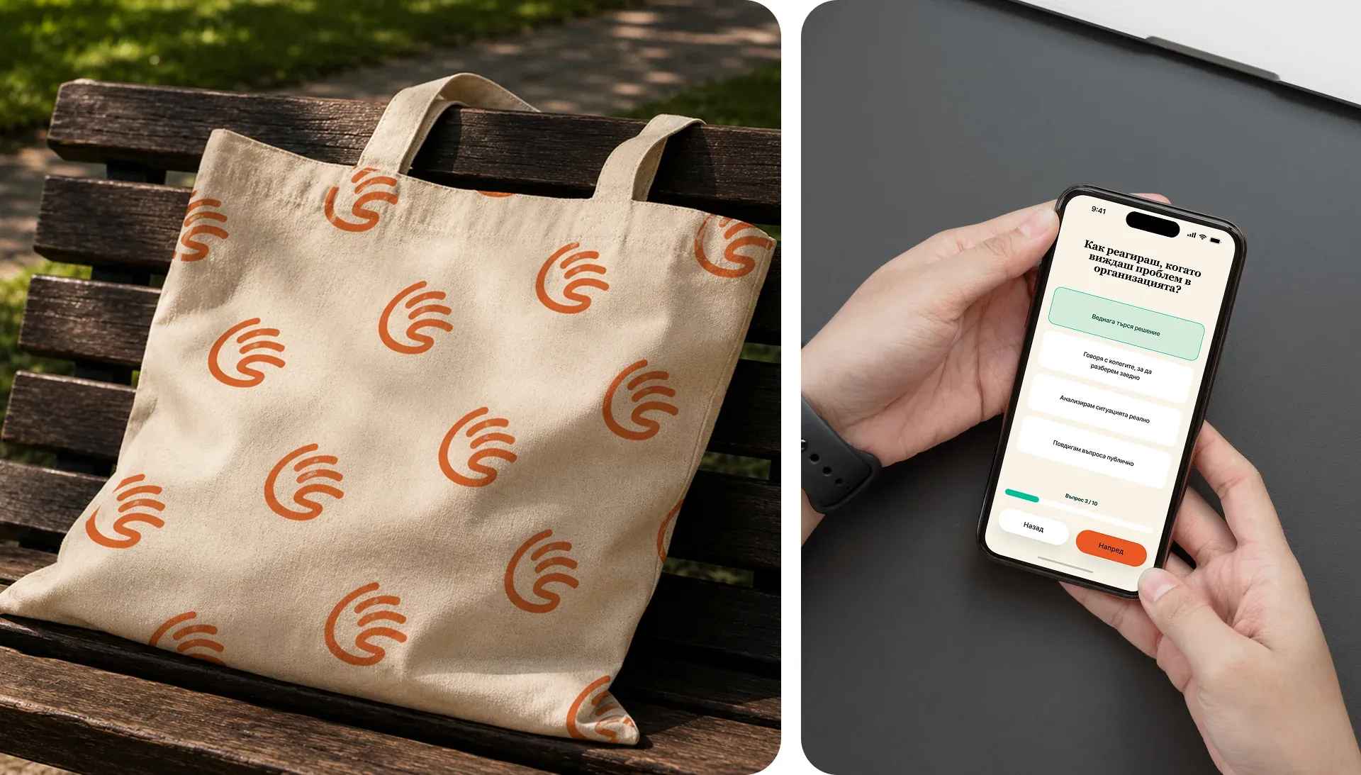
The identity was extended into everyday objects and practical touchpoints to see how the system behaves outside a presentation.
The symbol remains recognizable at small sizes, while the repeating pattern and bold color accents give the brand enough flexibility to work across merchandise and communication materials.

From Identity to Digital Touchpoints
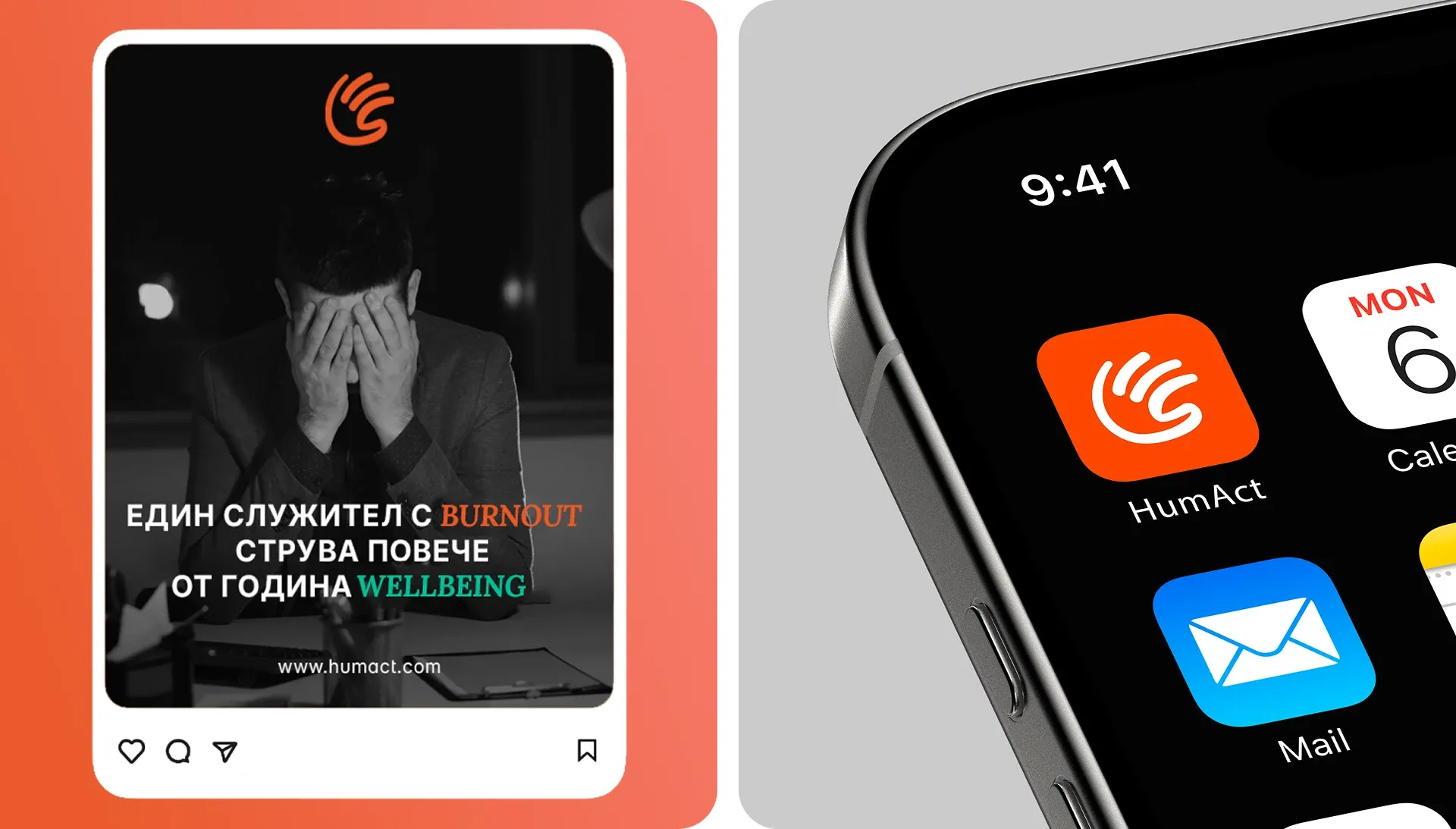
The visual language also carries into digital communication, where the brand needs to remain recognizable in much smaller spaces.
Campaign graphics and the app icon use the same core elements, keeping the identity consistent from larger promotional content down to a single mobile touchpoint.