Reimagining KEENON Robotics with a more human and approachable identity
Problem
KEENON operates in a highly technical category, building service robots for hospitality, catering, cleaning and other commercial environments.
The concept explores how the brand could feel more approachable and recognizable while still communicating intelligence, precision and technological expertise.
Solution
I developed a refreshed visual identity built around a simplified robotic character and a cleaner graphic system.
The new direction balances technology with personality, creating a brand that feels more friendly and accessible without losing the professional character expected from a global robotics company.
A symbol built around interaction
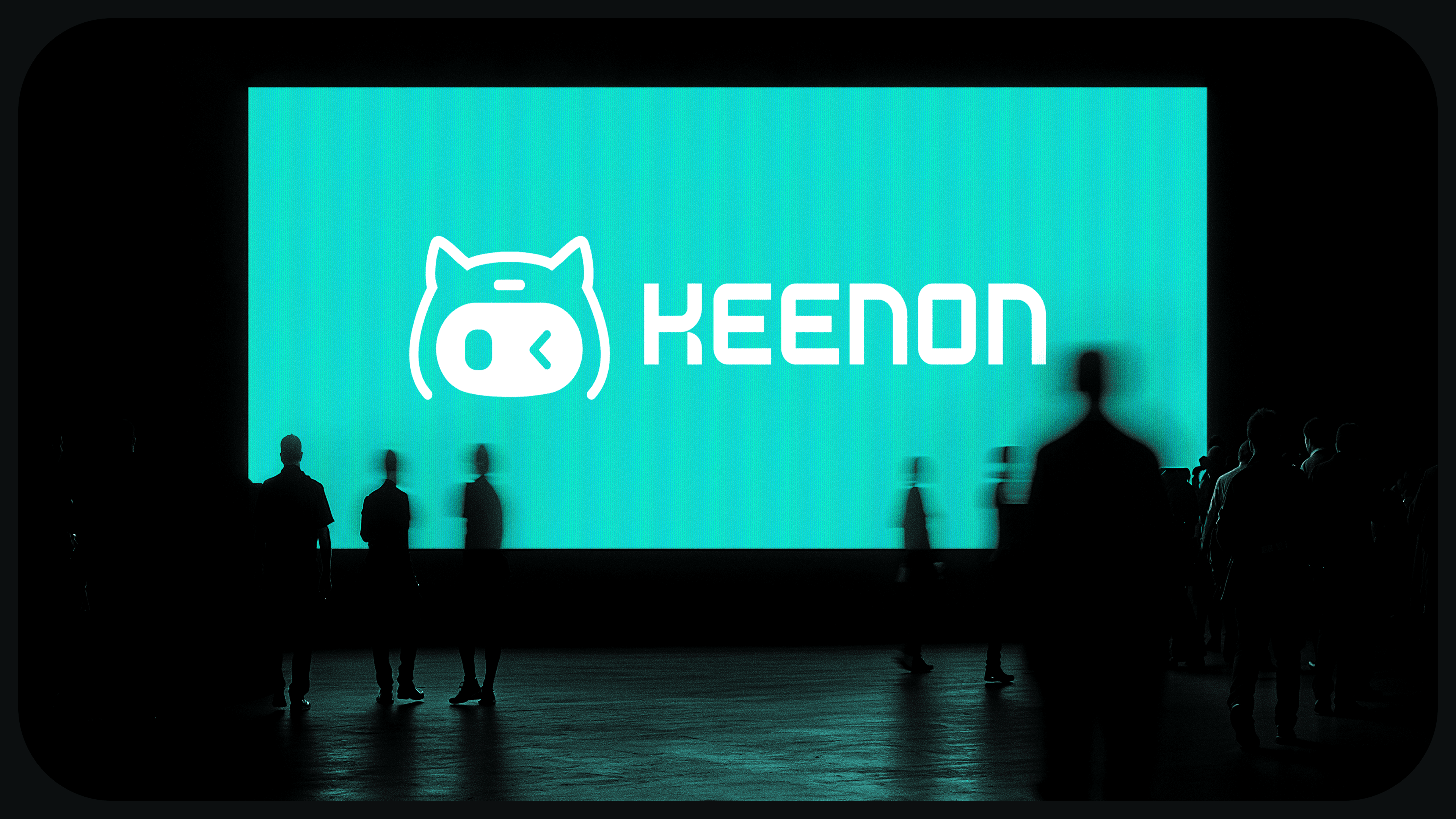
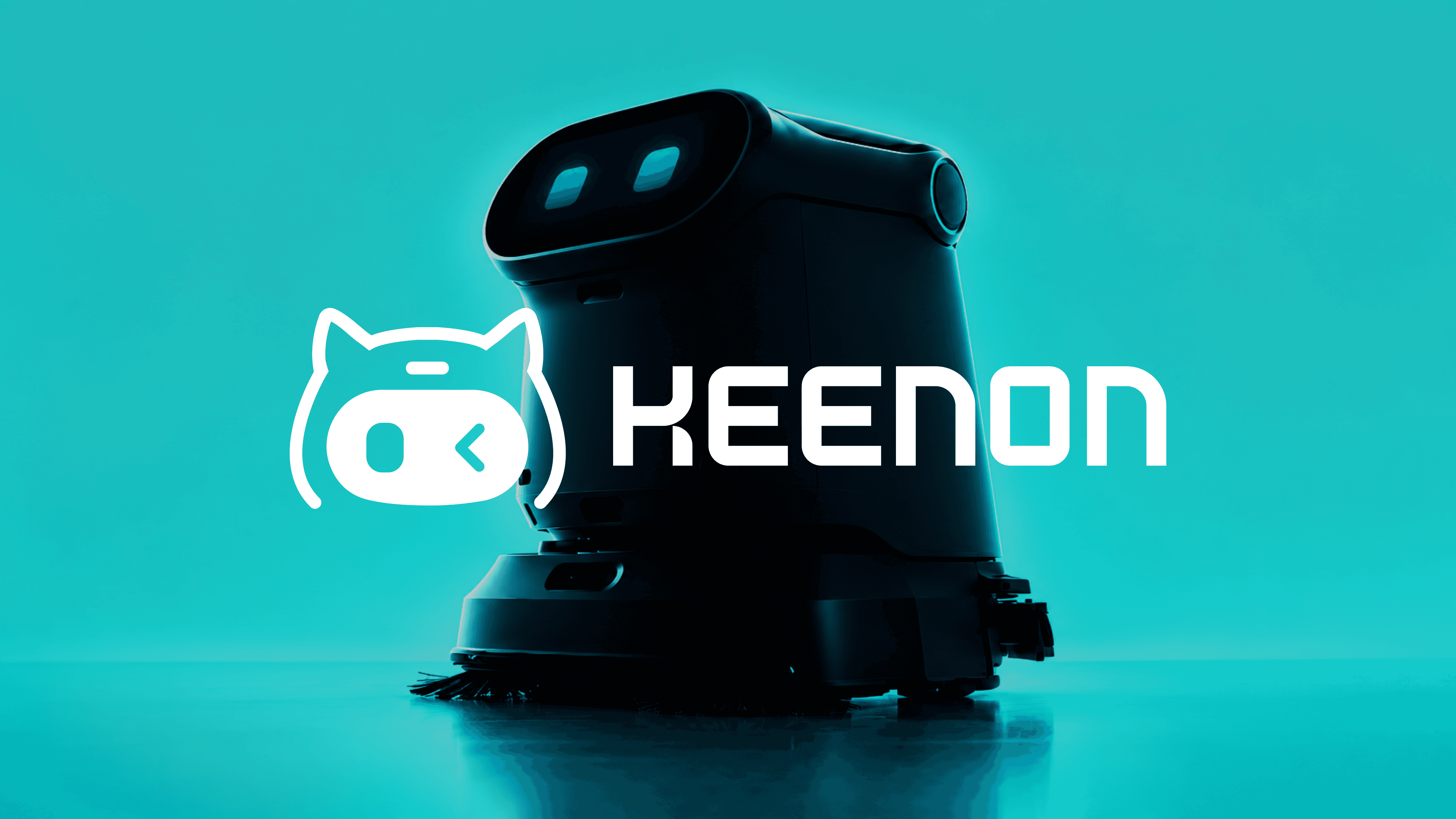
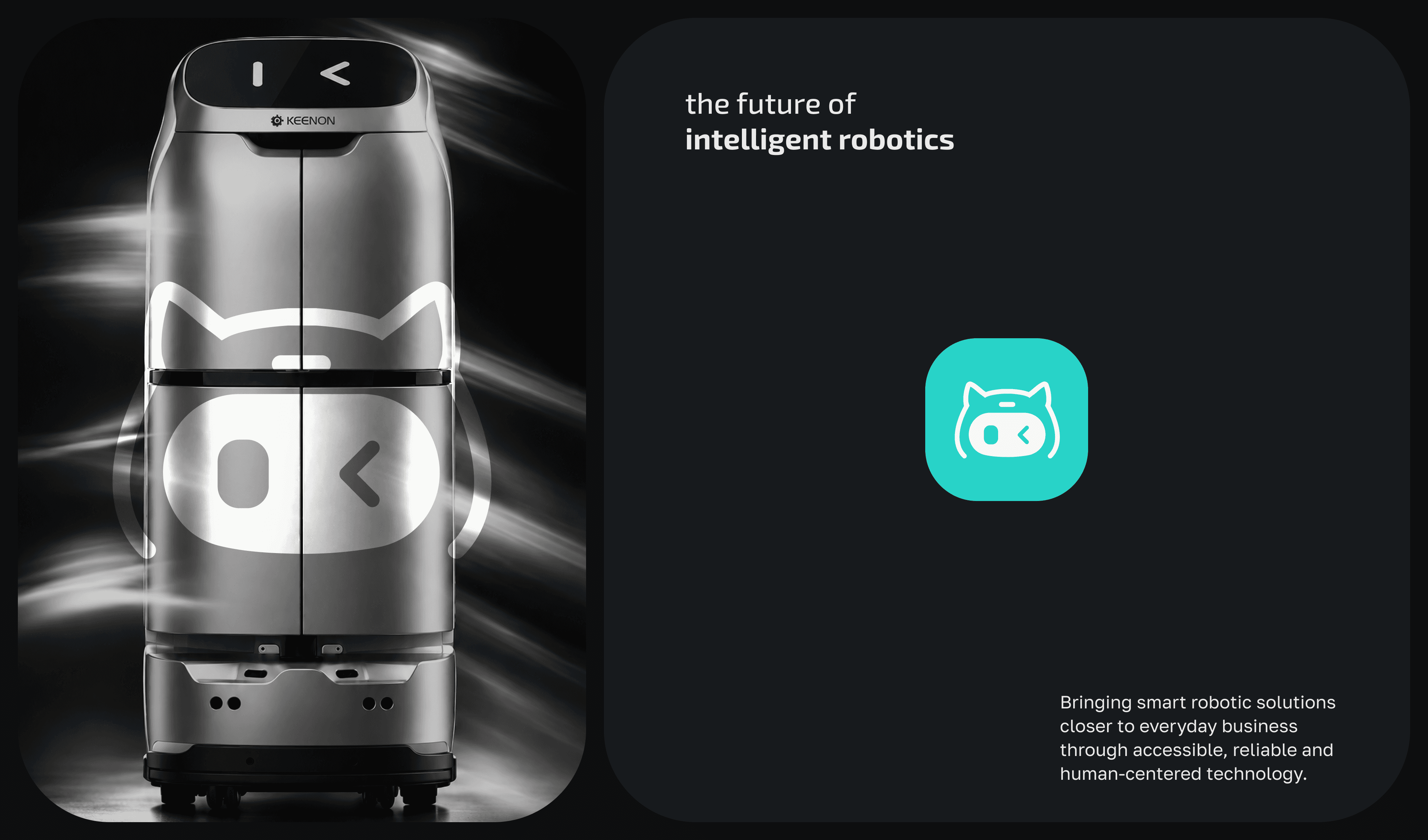
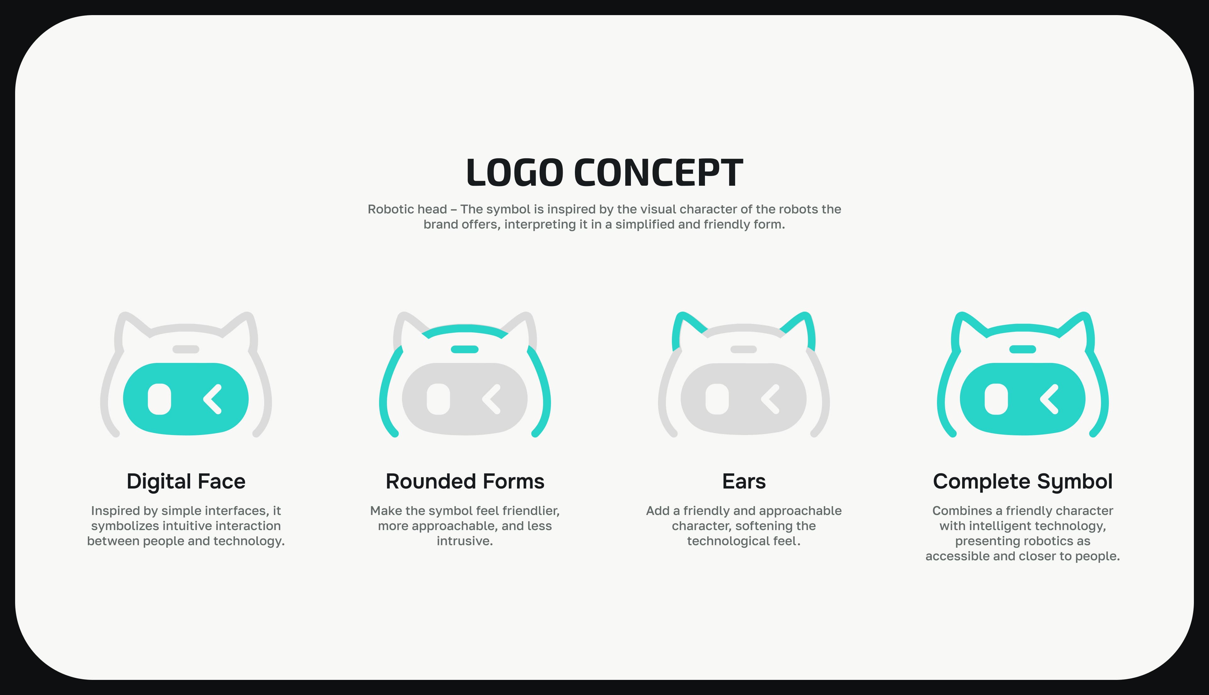
The new symbol simplifies the idea of a robot into its most recognizable features — a head, two eyes and a compact silhouette. The curved construction gives the character a more approachable personality, while the geometric structure keeps it connected to technology and precision.
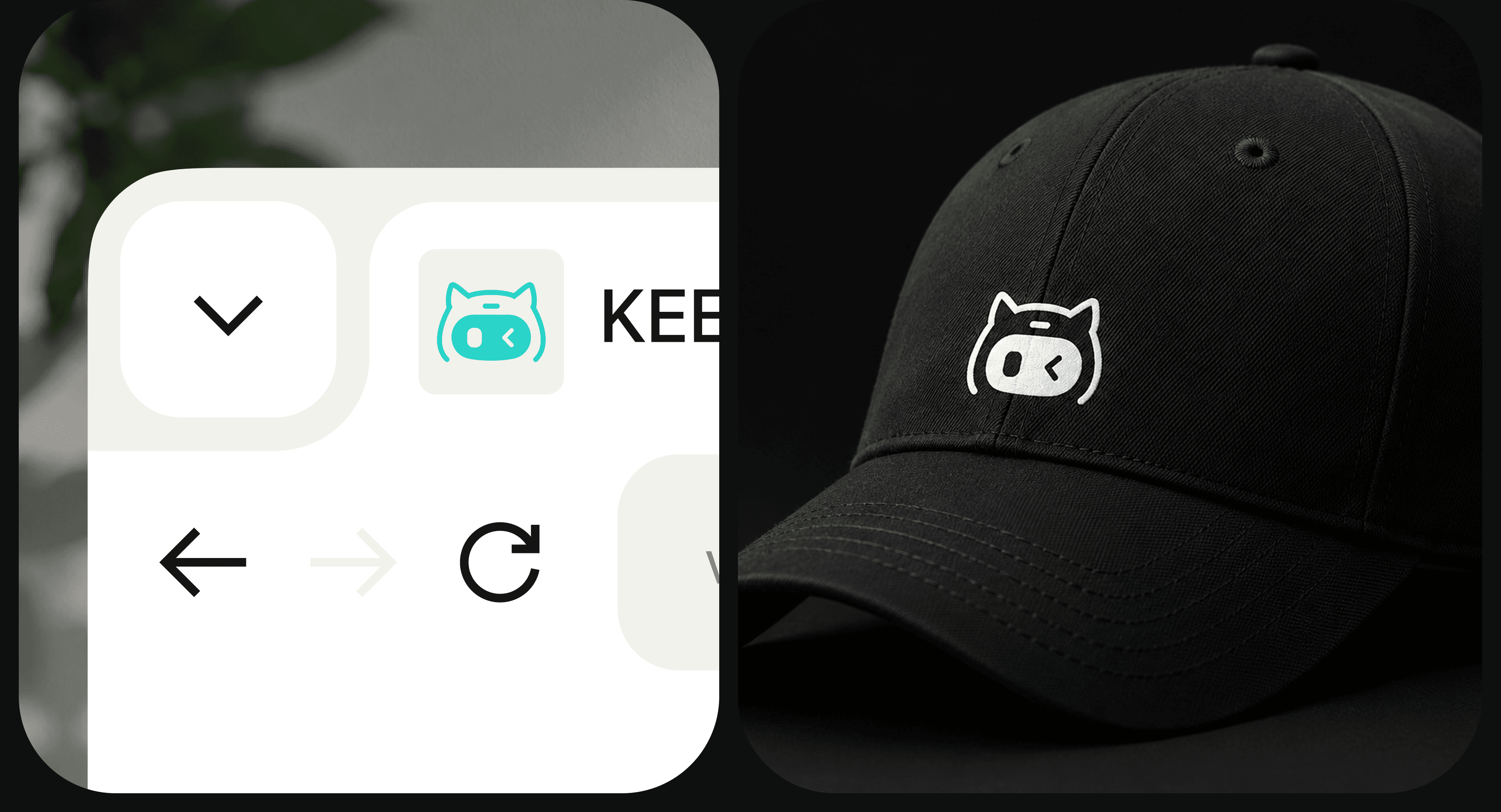
The goal was to create a symbol that could be recognized even without the KEENON wordmark.
A more energetic visual language
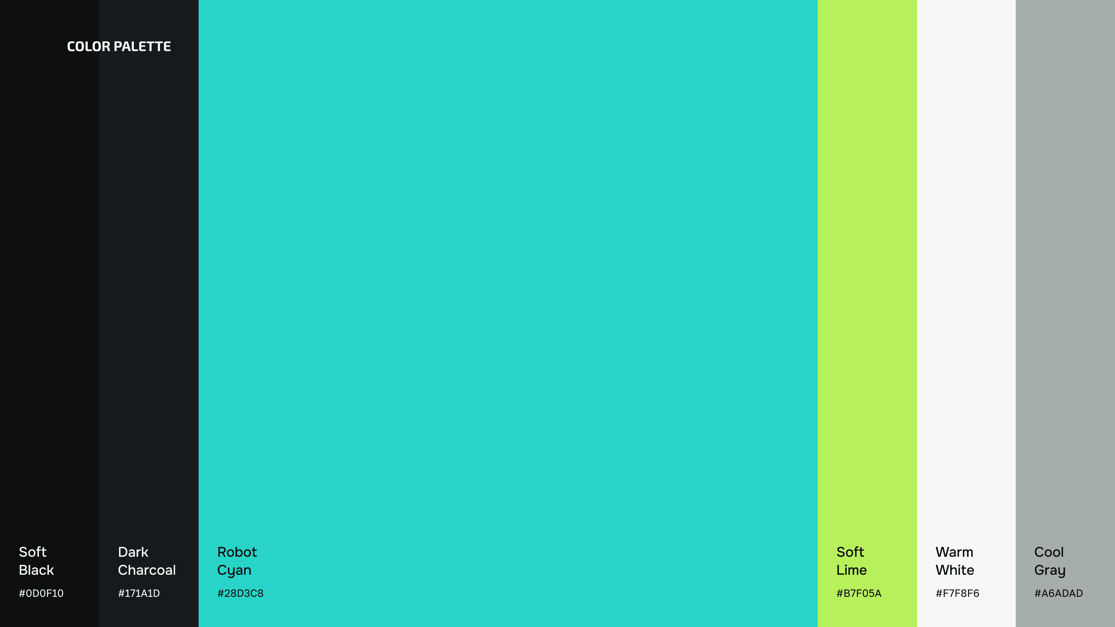
A bright turquoise becomes the main brand color, referencing technology while giving the identity a fresher and more approachable character.
Combined with black and white, the palette stays simple enough to let the robots and the brand symbol remain the focus.
Clear, modern and functional
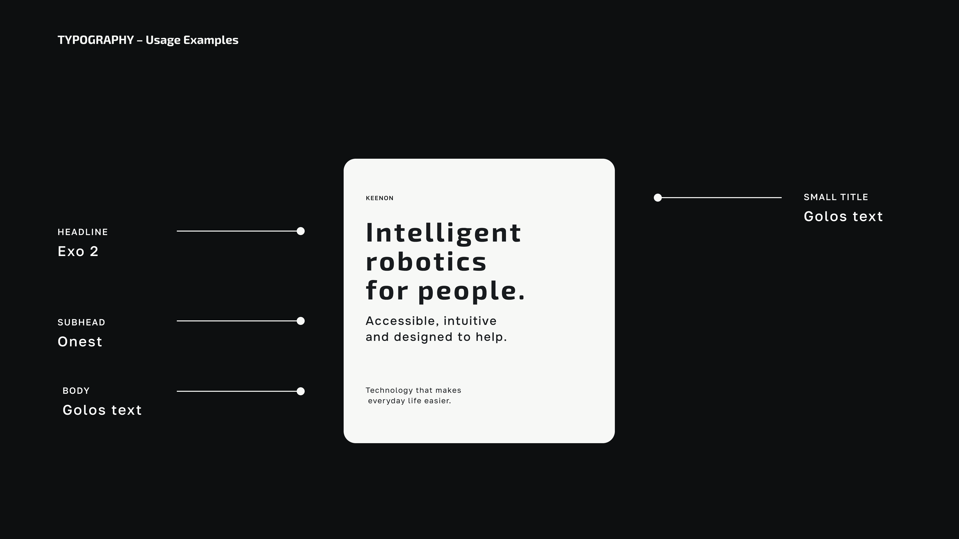
The typography follows the same principle as the identity — simple, contemporary and highly legible.
A clean sans-serif creates contrast with the more expressive symbol and keeps communication clear across both large brand statements and smaller interface applications.
One identity, multiple environments
KEENON robots operate across very different spaces — from restaurants and hotels to hospitals and commercial environments.
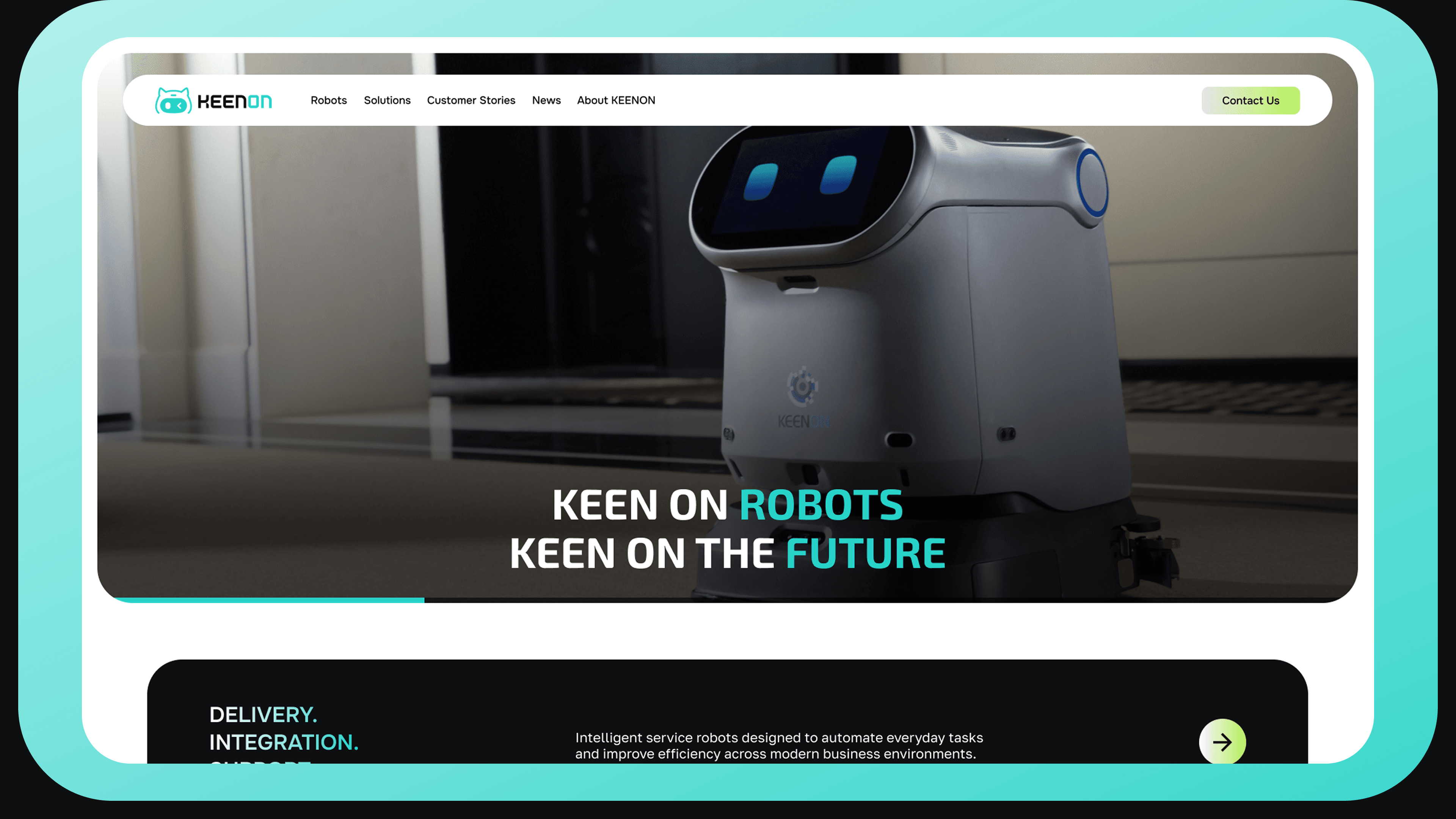
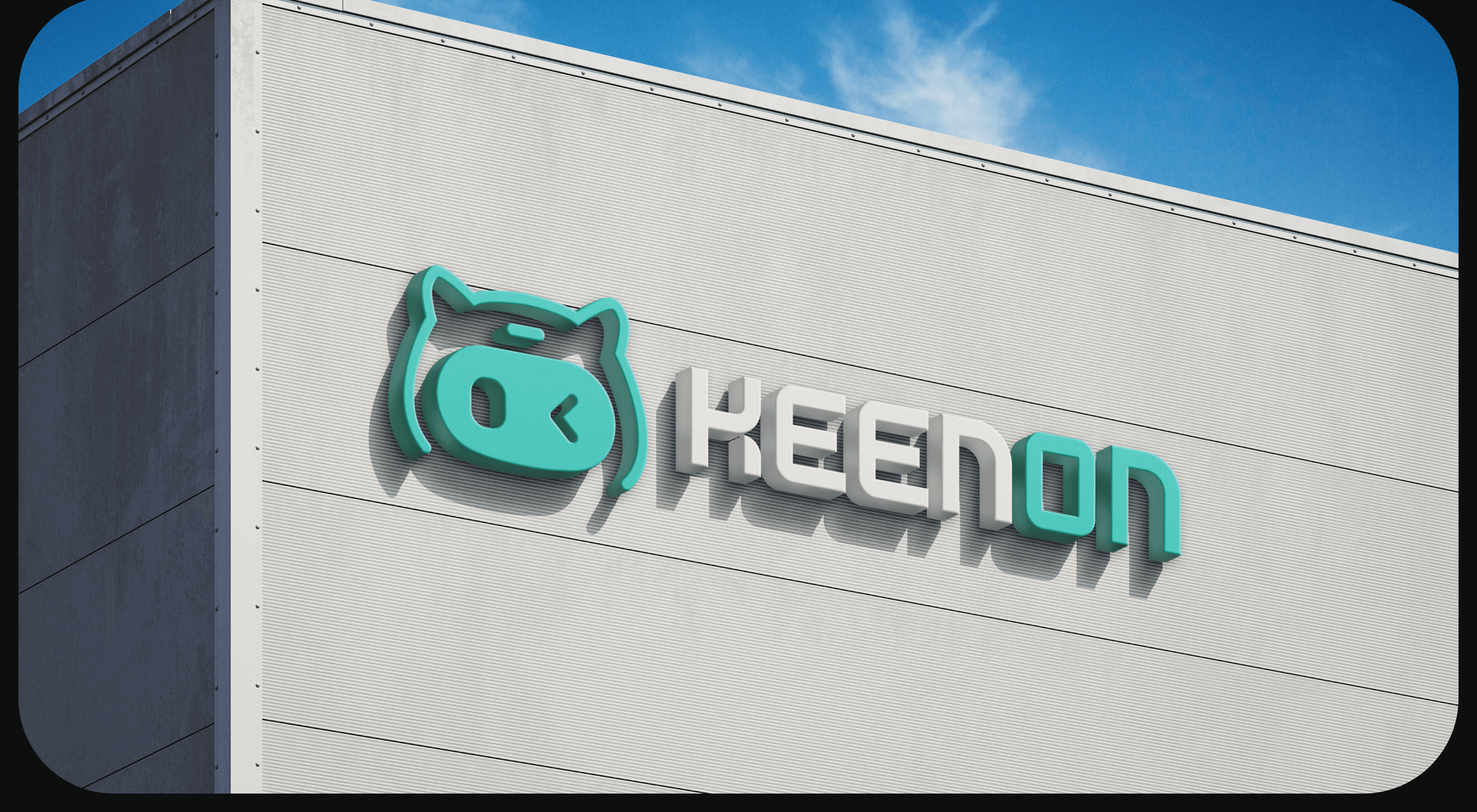
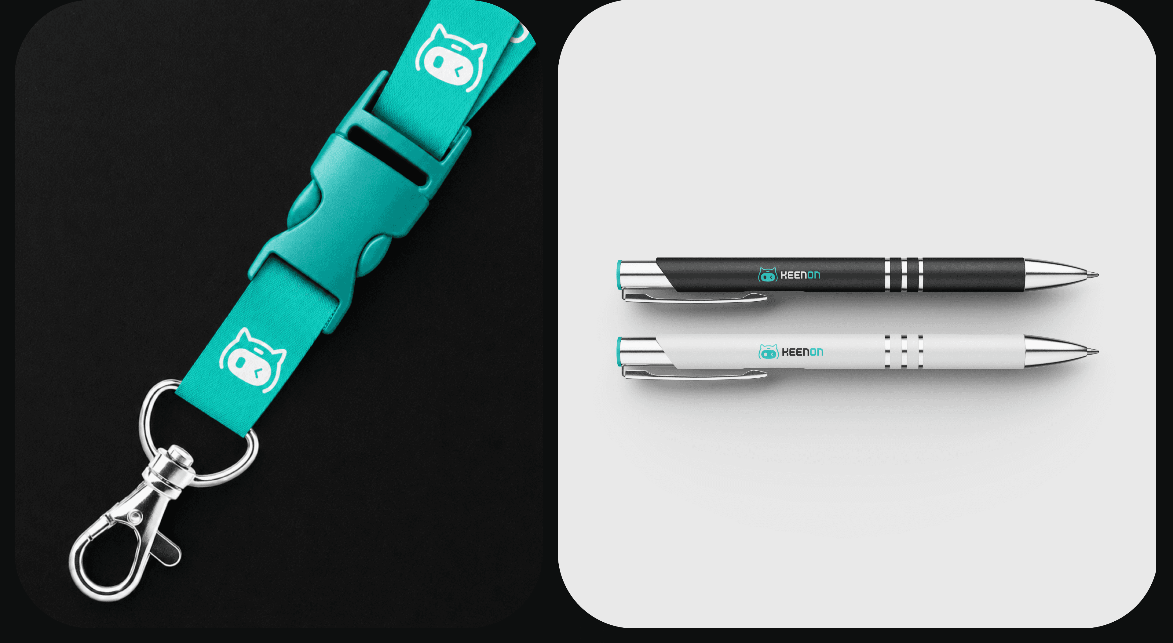
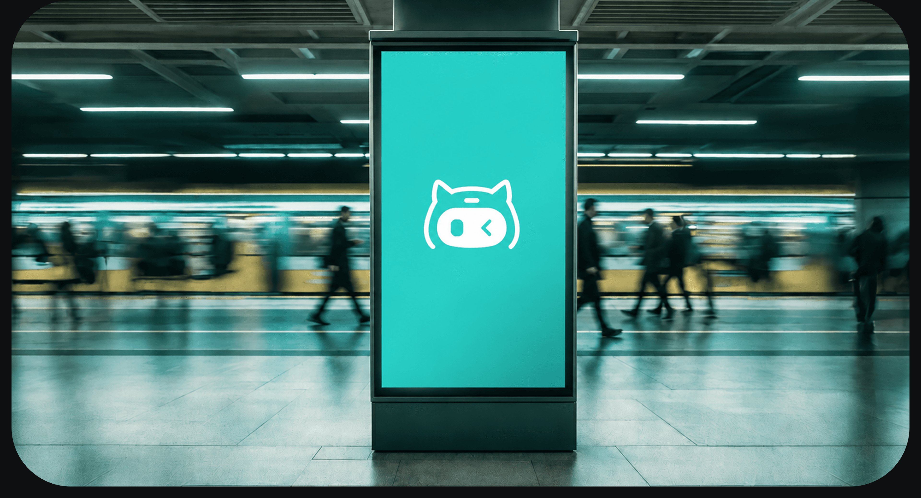
The visual system was therefore designed to stay consistent across multiple touchpoints, from digital communication to physical environments and the robots themselves.